Remove the <h3> and <h4> headers from the menu

Stuart Wright

Well-known member
Best practises for headings suggests that they should be hierarchical.
However, the page_container Conversation, Alert and Search h3 headings and the account_visitor_menu h4 headings in the drop-downs in the page header all appear above the h1 page title and therefore break this best practise.
Is there any reason why they are headings?
I have changed them all to divs on AVForums without any issues.

May I suggest that Xenforo changes them to divs?
 
Upvote 5
Do you happen to have a link to share so I can learn more about this "seo practice"? I don't find it counterproductive at all.
 

I don't find it counterproductive at all.
I'd be surprised if you actually noticed any change in the amount of traffic you get. But if there is advice from Google themselves, we have to follow it because your competitors will.
 
These pages should return a 403 code to any SEO crawler anyway.
And the search pages are you talking about the results or the form?
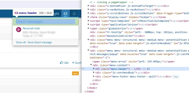
I'm talking about the headings included in the (direct message, alerts and search) drop-down menus within the template page_container which is used in every page. On this page, for example...
1.webp
 
I'd say they're probably appropriate as is, as they're all located within a <header> html tag, and I'm sure google is smart enough to differentiate between the header and main content of the page.

I'd be more inclined to suggest the body div instead be changed to a more semantic <main> html tag, which would send a clear indication that the main content of the page is within that html, and then google would interpret all h tags within the main appropriately.
 
Also worth noting that when logged out those won't appear anyway, so unless you're giving crawlers login access to crawl content, it's even less of an issue.
 
I'd say they're probably appropriate as is, as they're all located within a <header> html tag, and I'm sure google is smart enough to differentiate between the header and main content of the page.

I'd be more inclined to suggest the body div instead be changed to a more semantic <main> html tag, which would send a clear indication that the main content of the page is within that html, and then google would interpret all h tags within the main appropriately.
Erm no, they exist within the <body> tag, not the <head> tag.
Also worth noting that when logged out those won't appear anyway, so unless you're giving crawlers login access to crawl content, it's even less of an issue.
No again, the search is available to guests on the default installation.
 
Erm no, they exist within the <body> tag, not the <head> tag.

Sorry I meant the <nav> tag, so my point still stands.

I do think the main body of content should really be in a <main> tag these days though, and it's currently in a div with a class of body. I would hope that would be enough for google to understand that all the content is in there and to weight those title tags appropriately.

That's how reddit is structured, and all their content ranks very highly now, although I'm sure there's plenty of manual tweaking there due to their commercial arrangement.

Reddit also uses header tags outside of the <main> tag, when used in sidebars, although not in the nav as far as I can see.
 
The W3C indicate there's nothing wrong with using h tags in nav and sidebars. It's not a requirement that the H1 be at the very top of the page itself,


Their example uses them in various regions of the page including header, nav, main, aside and footer.

h tags are also used for accessibility navigation, so you may be making it harder for users with accessibility issues to find the search bar on your site by removing the h tag.
 
Last edited:
I stand by my previous points and when changing the Search and other heading tags to divs makes no difference to the appearance, then the only reason to have them is your suggestion that they might help with accessibility. And the reason not to have them is to comply with heading hierarchy best practises. I'm afraid the latter argument wins for me, but I'd like to hear from the XF team on why they chose originally to make them headings.
 
Which analysis site brought you these errors/warnings about this h tag hierarchy? Or is this a manual analysis on your part?
I can't find an SEO/best practices analyzer that reports these warnings.
 
The W3C indicate there's nothing wrong with using h tags in nav and sidebars. It's not a requirement that the H1 be at the very top of the page itself,


Their example uses them in various regions of the page including header, nav, main, aside and footer.

h tags are also used for accessibility navigation, so you may be making it harder for users with accessibility issues to find the search bar on your site by removing the h tag.
That is more for horizontal or vertical navigation rather than a dropdown menu. The only time a header in a dropdown navigation makes sense accessibility wise is if they are used in a megamenu as anchor points (which is why they are used by screenreaders).

Screenreaders (at least JAWS), reads the menu title/label first, and then would read the header which would make the header redundant unless there is more than one header in the dropdown.
 
Considering you can navigate the entire page structure using heading tags on JAWS I'm not sure why it wouldn't be useful to be able to easily jump to page sections such as the account dropdown, messages, alerts and search via heading navigation. These are still important sections with additional content and links within them that someone still frequently needs to be able to navigate to.
 
Last edited:
Considering you can navigate the entire page structure using heading tags on JAWS I'm not sure why it wouldn't be useful to be able to easily jump to page sections such as the account dropdown, messages, alerts and search via heading navigation. These are still important sections with additional content and links within them that someone still frequently needs to be able to navigate to.

Because you can activate those with link navigation, which is the usualy behavior by the blind people I know. The preferred method is to have keybinds to activate those menus to make navigation easier for them entirely.

Heading navigation is usually preferred for content, and the majority of blind people likely skip to content before using heading navigation. I would have to go over older data I have from when I was building the site for my stepdads site, but I tracked a lot of data and took about 2 years of feedback when refining that site.
 
Back
Top Bottom