Take a moment to visit a supermarket and slowly examine a long refrigerated shelf. As you age, you might notice that dealing with this overwhelming amount of information can become increasingly frustrating, depending on your mood and state of mind. This is a well-known phenomenon.
Why am I bringing this up?
Recently, I came across a forum where user information is positioned on the right side of the screen. As I browsed through it, I realized how soothing it is to have all that extraneous information out of the immediate view.
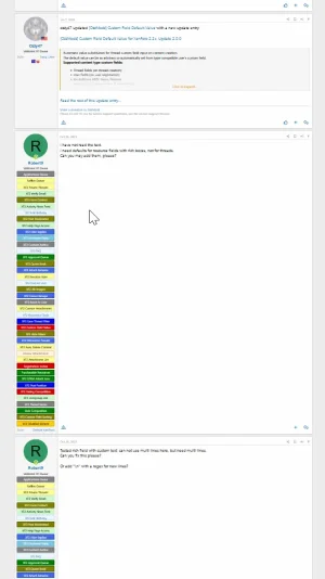
In contrast, take for example a forum managed by Ozzy, which bombards my user account with seemingly hundreds of banners. This constant distraction is so aggravating that I’ve lost interest in engaging with the forum altogether. It’s similar to how I’ve lost interest in browsing through supermarket shelves.

In the forum, I only go there to download my files, and in the supermarket, I’ve learned where to find my items and head directly to those sections without further distraction.
In summary: Is there an option to move user-related information to the right side of the page? Ideally, this would be a feature in the default forum layout without requiring a complete redesign.
If this option isn’t available, it should definitely be considered. Testing it could reveal a significant reduction in stress and distraction, as it would remove the constant visual interruption of less relevant content, allowing users to focus more on the text they wish to read.
Having managed forums since VB3, I’ve observed that people’s attention spans have diminished over time. They seem less able to process and respond thoughtfully to lengthy texts, often picking out isolated parts of a message without grasping the overall context. Conversely, users are increasingly irritated by lengthy posts, as seen in the German Xendach forum, where a regular user harshly criticizes lengthy contributions.
These are symptoms of information overload and sensory overwhelm. Even small adjustments, like relocating user information out of the main view, could help mitigate this issue by making interactions less stressful.
Please try this yourself and see if you notice a difference. It might be clear how much more relaxing it is to avoid constant visual clutter.
Please consider adding this option; the world will thank you for it.
Why am I bringing this up?
Recently, I came across a forum where user information is positioned on the right side of the screen. As I browsed through it, I realized how soothing it is to have all that extraneous information out of the immediate view.
In contrast, take for example a forum managed by Ozzy, which bombards my user account with seemingly hundreds of banners. This constant distraction is so aggravating that I’ve lost interest in engaging with the forum altogether. It’s similar to how I’ve lost interest in browsing through supermarket shelves.

In the forum, I only go there to download my files, and in the supermarket, I’ve learned where to find my items and head directly to those sections without further distraction.
In summary: Is there an option to move user-related information to the right side of the page? Ideally, this would be a feature in the default forum layout without requiring a complete redesign.
If this option isn’t available, it should definitely be considered. Testing it could reveal a significant reduction in stress and distraction, as it would remove the constant visual interruption of less relevant content, allowing users to focus more on the text they wish to read.
Having managed forums since VB3, I’ve observed that people’s attention spans have diminished over time. They seem less able to process and respond thoughtfully to lengthy texts, often picking out isolated parts of a message without grasping the overall context. Conversely, users are increasingly irritated by lengthy posts, as seen in the German Xendach forum, where a regular user harshly criticizes lengthy contributions.
These are symptoms of information overload and sensory overwhelm. Even small adjustments, like relocating user information out of the main view, could help mitigate this issue by making interactions less stressful.
Please try this yourself and see if you notice a difference. It might be clear how much more relaxing it is to avoid constant visual clutter.
Please consider adding this option; the world will thank you for it.
Last edited:
Upvote
0