I mean if you do end up changing it, please don't change it by much. The default Xenforo theme is one of the reasons I keep coming back to this forum, even if I'm not looking for help or sharing. The colors are cool and inviting. My site's jacked up right now so I brought back the default Xenforo theme to troubleshoot some issues and a noob hit me up saying they love the theme and that I should keep it (I'm not though).
You are using an out of date browser. It may not display this or other websites correctly.
You should upgrade or use an alternative browser.
You should upgrade or use an alternative browser.
Please Don't Change The Default Xenforo Style
- Thread starter DRE
- Start date
And you know this maaaynne. Gotta graffiti the block.You shall darken the wishy washy default colors. You shall. So let it be written.
iknowriteThat was random, DRE

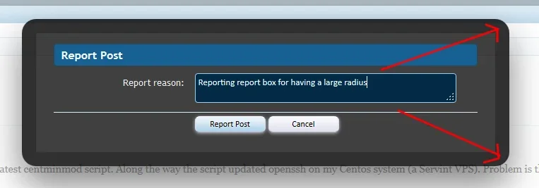
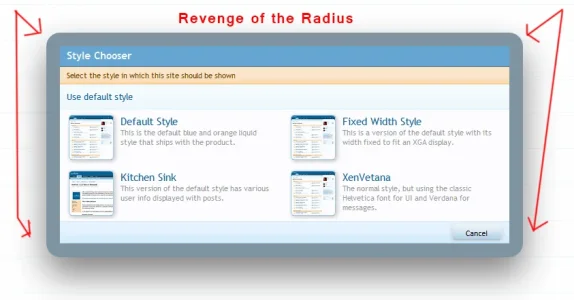
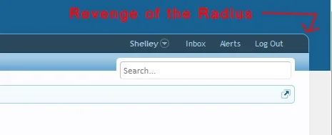
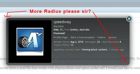
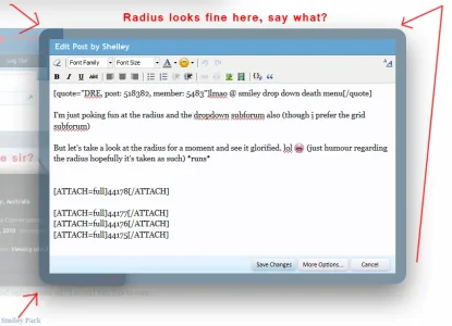
I know a few people have posted about the default theme being too bright but I like it (apart from the navigation 200000000px radius) but apart from that a good solid default style you can put trust in (minus the smiley dropdown death menu also) but yeah good style (add dropdown subforum on index to peeve list too). 
She's good at doing that.. pointing something out that just eats away at you until you have to change it LOLLOL Shelley I hadn't really noticed that massive radius, but now you've pointed it out, it's getting on my nerves
LOL Shelley I hadn't really noticed that massive radius, but now you've pointed it out, it's getting on my nerves
TBH - I prefer the xf default theme over any other product (but then I would say that) but the layout in general is more appealing, more usable and easier to navigate to other areas and that is where xf excels (amongst every other area) so jokery all aside the default style here is definitely to my liking and i prefer it over anything I've seen so I very much agree with DRE in that department, don't change it.
Terrifying to disagree with Shelley but I love the curvy bits.
/runs hides
But yes I'm happy with the default in general. Fond of it when I come here.
Not keen on the ominous black popups ... but thats just me.
I expect those who want change want a dark style. Why not have just one simple dark style as an official alternative?
It wouldn't even need to change all its colours, just the larger areas, and the text that appears on them. Simple Black I guess. Would make the Dark camp happy - demo style changing for potential buyers - and give a new admin wanting a Dark style a basis to work from.
Terrifying to disagree with Shelley but I love the curvy bits.
/runs hides
But yes I'm happy with the default in general. Fond of it when I come here.
Not keen on the ominous black popups ... but thats just me.
I expect those who want change want a dark style. Why not have just one simple dark style as an official alternative?
It wouldn't even need to change all its colours, just the larger areas, and the text that appears on them. Simple Black I guess. Would make the Dark camp happy - demo style changing for potential buyers - and give a new admin wanting a Dark style a basis to work from.
Doing a dark style for xenforo is more trouble than it's worth imo. If your referring to really dark because then you have to adjust the editor which is a real PIA and with the editor you also need to adjust and modify the editor spritesheet and the icons within, with that the icons in the editor span accross the editor spritesheet, standalone imagery and the xenforo-ui-spritesheet.
You would then need to change the gradients as these are really suited for light based backgrounds and not dark backgrounds.
I could make a long list, but in short I personally think it's more trouble than it's worth and it's a time consuming task.
Edit: Don't get me wrong I like my radius. I just prefer them smaller than the xf default value.
Adam Howard
Well-known member
The only change I think should be made is...
* You'd be surprised on how much is here that you can't see because they're all the same color
- Responsive design
- Clearly define all the boarder and layers *
* You'd be surprised on how much is here that you can't see because they're all the same color
The only change I think should be made is...
That's it. Everything else is OK.
- Responsive design
- Clearly define all the boarder and layers
I'll be honest, I would really like to see responsive design in the core that would be icing on the cake.
Thanks for explaining Shelley. Not being a style designer I just thought of a few basic colour changes. Clear now.Doing a dark style for xenforo is more trouble than it's worth imo.
What do you have against rounded corners? We are in 2013, not in 2001.
Let me throw a question back at you, Luxus. What have you got against not reading posts?
I don't think I ever did say I didn't like radius. Fact1. I did however, say....... *drum rolls* *sound of fireworks being shot in the air* *people in the background waving flags* that I think the default radius values are a little too high for my taste. *tumbleweed shoots past*
Are we really in 2013? *glances at smiley dropdown menu*
Honestly though, I understand what your saying, actually I don't please read what I said.
My reply wasn't a direct response to your post, else I would have quoted it. It was more a general response to all people who doesn't like rounded corners, regardless of the depth. That "you" referred to people who doesn't like rounded corners.-snip-
Similar threads
- Question
- Replies
- 4
- Views
- 1K
