You are using an out of date browser. It may not display this or other websites correctly.
You should upgrade or use an alternative browser.
You should upgrade or use an alternative browser.
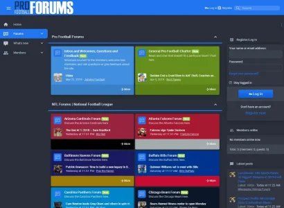
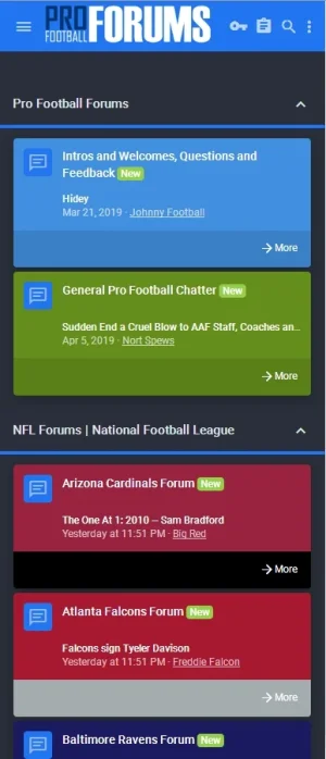
Plain Jane, all business. Pro Football Forums
- Thread starter Max Taxable
- Start date
I suggest to increase the font size for the node names.
I also would suggest you to use a dark background color for the node names. A dark stripe behind the node names.
The white font color gets unnoticed or really hard for the eyes when it meets a light background color. If you want to do the work and keep up the colored thingy, then use the team's secondary/tertiary colors for the background color. Maybe there is a better elegant way than my suggestion below, like the background stripe crossing the whole squared node instead of just the title.
Before:
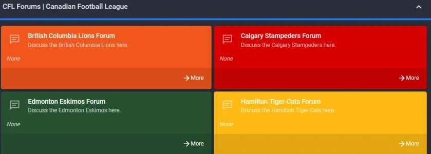
After:

I also would suggest you to use a dark background color for the node names. A dark stripe behind the node names.
The white font color gets unnoticed or really hard for the eyes when it meets a light background color. If you want to do the work and keep up the colored thingy, then use the team's secondary/tertiary colors for the background color. Maybe there is a better elegant way than my suggestion below, like the background stripe crossing the whole squared node instead of just the title.
Before:

After:

Every pro team has its own node. The nodes represent the individual official team colors. Aggregation.Hey, I like it but gotta say there’s too many colours for too many nodes!
Great ideas, thanks!I suggest to increase the font size for the node names.
I also would suggest you to use a dark background color for the node names. A dark stripe behind the node names.
The white font color gets unnoticed or really hard for the eyes when it meets a light background color. If you want to do the work and keep up the colored thingy, then use the team's secondary/tertiary colors for the background color. Maybe there is a better elegant way than my suggestion below, like the background stripe crossing the whole squared node instead of just the title.
Before:
View attachment 200391
After:
View attachment 200390
I got into it and realized I hadn't finished the CFL nodes at all yet, didn't have the block footer colors in and hadn't yet edited the main node color to account for the white type. See how this looks to you now:I also would suggest you to use a dark background color for the node names
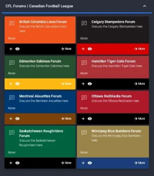
There's 8 fewer now, since the AAF folded. No point in keeping forums for defunct teams. That league lasted only 9 weeks!too many nodes
Better for the eyes now. When styling, don't forget that some people don't have good eyesight, so you have to take that in account. Also bright colors hurt the eyes over time, so always try to use dark or dimmed colors. And pay attention what the background of the texts are, that you always have a balance between dark background and light font-color or light background and dark font-color. Also increasing the size of the font helps, too.
Yep I know all of those best practices and used to take them into priority consideration, been at this a long time. I choose to ignore most of them now. Following them dogmatically makes everything on the web look the same, cookie cutter. Fortunately I suspect most users will be in the threads or on the thread list page, where the only color there is in the title banner above, carried over from the forum node main color. Like this:Better for the eyes now. When styling, don't forget that some people don't have good eyesight, so you have to take that in account. Also bright colors hurt the eyes over time, so always try to use dark or dimmed colors. And pay attention what the background of the texts are, that you always have a balance between dark background and light font-color or light background and dark font-color. Also increasing the size of the font helps, too.
FORUM PAGE:
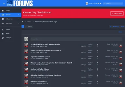
THREAD PAGE:

I'll leave the font size alone, for mobile browsing. Which more and more is the customer.
Originally I had all the team logos in the nodes... But thought better of it and decided to avoid any possible trademark or copyright issues and just went with team colors instead. It looked like this, at one time:Looks great, Manster. It would be awesome if you could insert faded team logos for each individual node, but don't know if there is a copyright issue.
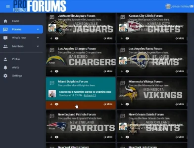
You can see I was already exploring the use of colors instead, the Miami Dolphins node being the first one I tried to change. The other issue was, all those images was making for a really BIG pageload. I prefer to keep pages svelte as far as kb load goes. And again, here we were with the white type hard to read for most of the thread titles.
Note that this style is out-of-the-box "FlatAwesome+" from Themehouse, with really nothing done to it custom at all except the node coloring. Hence why I'm saying "Plain Jane."
Originally I had all the team logos in the nodes... But thought better of it and decided to avoid any possible trademark or copyright issues and just went with team colors instead. It looked like this, at one time:
View attachment 200423
You can see I was already exploring the use of colors instead, the Miami Dolphins node being the first one I tried to change. The other issue was, all those images was making for a really BIG pageload. I prefer to keep pages svelte as far as kb load goes. And again, here we were with the white type hard to read for most of the thread titles.
Note that this style is out-of-the-box "FlatAwesome+" from Themehouse, with really nothing done to it custom at all except the node coloring. Hence why I'm saying "Plain Jane."
Wow that looks much better! You should totally customise the images so you do not copyright and use them because that looks beautiful!
When its 40 images and perhaps more later when the XFL starts playing next year, it's really a non-starter to use images for the nodes. Pageload approaches 2mb with the images. Unacceptable. Plus I have no idea how to customize an image that still uses the logos. If you don't use the logos, might as well just use color.Wow that looks much better! You should totally customise the images so you do not copyright and use them because that looks beautiful!
Haha! Brain fart, more like. I use "FlatAwesome+" on another of my xF sites. This is UI.X pro dark by you if I'm not too addled. Something like that.
Typo?
Apologies.
Good choice. It looks great either wayOriginally I had all the team logos in the nodes... But thought better of it and decided to avoid any possible trademark or copyright issues and just went with team colors instead. It looked like this, at one time:
View attachment 200423
You can see I was already exploring the use of colors instead, the Miami Dolphins node being the first one I tried to change. The other issue was, all those images was making for a really BIG pageload. I prefer to keep pages svelte as far as kb load goes. And again, here we were with the white type hard to read for most of the thread titles.
Note that this style is out-of-the-box "FlatAwesome+" from Themehouse, with really nothing done to it custom at all except the node coloring. Hence why I'm saying "Plain Jane."
Similar threads
- Replies
- 11
- Views
- 3K

