Hello everyone. Two questions:
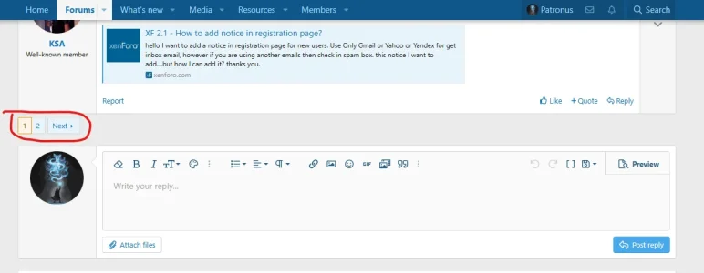
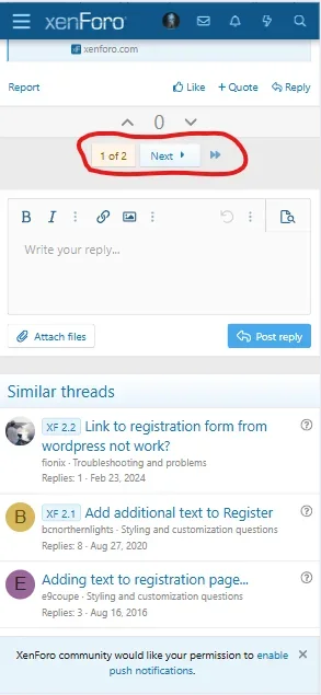
1. I change the color and font of the page selector in the styles, but it only changes in the desktop version. It doesn't change on mobile. How can I manage the style on the mobile version?
2. And I would also like it to look the same on mobile as on the desktop version - that is, with separate squares with page numbers, and not like on the phone version "one of..." How can I do this? Please help me
on desktop

on mobile

1. I change the color and font of the page selector in the styles, but it only changes in the desktop version. It doesn't change on mobile. How can I manage the style on the mobile version?
2. And I would also like it to look the same on mobile as on the desktop version - that is, with separate squares with page numbers, and not like on the phone version "one of..." How can I do this? Please help me
on desktop

on mobile
