Not a bug p-sectionLinks h-scroller css overflow issue for link content wider than 1200px

bzcomputers

Well-known member
Affected version
2.2
If the total displayed length of links contained within <div class ="p-sectionLinks"> exceeds 1200px there is a css overflow issue. The text overflow is still "visible" beyond the .p-sectionLinks-inner which has a max-width: 1200px. It appears the current css applies "overflow: visible" to all screens wider than 768px, which will not work for screens greater than 1200px without breaking the inner width constraints and also possibly creating a full page horizontal scroll.

To duplicate you will need a screen width greater than 1200px and just add additional section links to get the text on the line to overflow 1200px, you will then see the initial overflow issue. Keep adding links to be wider than your max screen width to view the full page horizontal scroll issue that can also be caused.
 
same thing with <div class="p-nav-scroller hScroller" data-xf-init="h-scroller" data-auto-scroll=".p-navEl.is-selected">

...current css applies "overflow: visible" to all screens wider than 768px which will not work when total link widths exceed 768px

-----------------
* - rechecking this second overflow issue instance. This second report may not be an issue, only seems to appear when inspecting, page refresh seems to fix overflow in this case, will report back
 
Last edited:
Are you still experiencing this? I'm not able to reproduce the behavior as described. The navigation items are contained within the horizontal scroller, even at viewport wider than 1200px.

screenshot-8zAxjO.webp
 
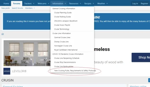
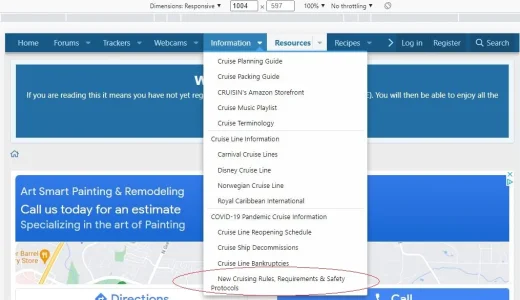
I'm only seeing the issue currently continue in the drop down menu. If I use Chrome to reduce the screen size to test and re-enlarge checking both times the issue goes away occasionally (link correctly appears as 2 lines) but as soon as I'm back to full screen the issue reappears, as below.

Normally what is shown:

overflow1.png

Occasionally shown correctly when testing screen sizes in Chrome:

chrome-screen-adjust.webp
 
This is related to a modification you've made to open navigation menus when hovering over top-level items. Your displayed menu inherits CSS rules that cause the lines not to wrap. The core behavior creates menus dynamically as direct descendants of <body>, which avoids this. You would have to seek support from the author of the modification.
 
Back
Top Bottom