Organize Alerts better: by type or batched

arn

Well-known member
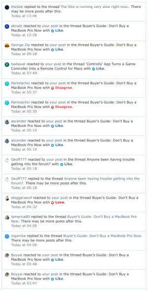
I understand the desire to keep the Alert system somewhat simple. But with the wide variety of alerts that you can get now, there can be a lot of noise.

  • Reactions specifically can drown out other alerts if you have a post that receives a lot of likes. While it's nice to get the reaction feedback, it definitely drowns out other alerts
  • Replies to watch threads is fine, but again, should be distinct from Reactions.
  • Mentions and Quotes are probably the top tier of alerts. The ones you don't want to miss, and could be highlighted separately.

The way I see it, there are a couple of ways you could go.

  • Split alerts into categories. But this complicates the UI a bit.
  • Batch alerts together. Arn and 5 others reacted to your post with Like.
 

Attachments

  • Screen Shot 2021-02-09 at 6.34.11 PM.webp
    Screen Shot 2021-02-09 at 6.34.11 PM.webp
    89.6 KB · Views: 45
Upvote 15
I posted the below in another suggestions thread before I saw this more recent one.

I do think the Alerts system should be more refined, whether this be alert folding/grouping, or otherwise.

It is probably true that the Alert management applies more to certain types of Alert than others, and so deciding what should be visible immediately plays a role here; information about reactions is summarised below each content, yet each reaction generates a new alert to the user. This takes up space in the Alerts list. Mentions and quotes are arguably more important and should be visible without scrolling.

It is also worth consider what options a user might have when it comes to deciding how Alerts are grouped/managed, based on what they feel is important.
 
But with the wide variety of alerts that you can get now, there can be a lot of noise.
Agree. Users are starting to acknowledge and complain that the Alert system jus isn't working optimally for them anymore, and making their experience detractive rather than enhanced.

Even my own experience here with XF alerts has detracted across v 2.2 and v2.3. The latter especially, being unable easily clearly differentiate Alert types prioritise the ones most important to me.


Split alerts into categories. But this complicates the UI a bit.
This is what I would like to see, and rather than complicate the UI I think it can be done elegantly.
For example, there is a lot of empty/unused space beside the Alerts header than could get icons to filter/segregate the Alert types.....

Screenshot 2024-07-29 at 16.44.27.webp
 
Last edited:
Agree. Users are starting to acknowledge and complain that the Alert system jus isn't working optimally for them anymore, and making their experience detractive rather than enhanced.

Even my own experience here with XF alerts has detracted across v 2.2and v2.3. The latter especially, being unable easily clearly differentiate Alert types prioritise the ones most important to me.


This is what I would like to see, and rather than complicate the UI I think it can be done elegantly.
For example, there is a lot of empty/unused space beside the Alerts header than could get icons to filter/segregate the Alert types.....

View attachment 307416
That’s neat, I have to admit.
 
Back
Top Bottom