XF 1.4 Online Indicator Moved

JamesBrown

Well-known member
Any idea what I have done to cause this indicator to float left like that? Thanks

onlineindicator.webp
 
Last edited:
You have increased the width of the message user info block.

You will need to change the position of the online indicator - something like left: 19px should do it.
You can do that in Style Properties -> Message Elements -> Author Online Status Indicator
 
I see an out of position avatar on the top one as well as the original example its to the right. From a desktop and knowing the site I could probably tell u why. No guesses off the top of my head.
 
You'll have to give a specific thread where you see this, all the ones I looked at show the online indicator out of position.

You have several issues with your style that you need to address:
  1. As Brogan said, your message user info block has had its width increased. Due to this, avatars aren't centred in the block and the knock on is the misplaced online indicator (Also out of place on mobiles).
  2. Your sign-up button needs looking at - the text overflows the button
  3. Adverts don't fit properly in various views including on tablets and mobiles. You definitely need to sort this, especially if using AdSense.
 
It gets stranger

If I am logged out, viewing as a guest then all avatars and the indicator seem OK. When I am logged in as admin it's my own and just one other I can see messed up (not an admin) All the others are good.


As a guest
onlineind.webp

Logged in as admin

onlineind2.webp


AFAIK I haven't increased the message user info block, what width should it be.
 
There's something going on with avatars. When I inspect elements via the browser, I'm seeing this:

upload_2014-10-17_14-24-55.webp

whereas on my site and on here, I'm seeing this:
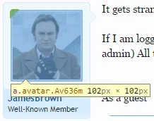
upload_2014-10-17_14-26-43.webp

Notice the size difference - 123px in the first, 102px in the second. Looks like you've changed something relating to avatars in the SPs.


I've also noticed this above avatars:
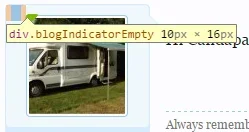
upload_2014-10-17_14-30-22.webp

You might want to disable blogging temporarily to rule out if this element is causing any issues.

You do need to check your online indicator in other screen resolutions (e.g. on tablets, mobiles or just by resizing your browser). You'll see that it's not aligned on these either:

Narrower view (e.g. tablet):
upload_2014-10-17_14-32-6.webp

Very narrow view (e.g. mobile):
upload_2014-10-17_14-33-11.webp


As mentioned previously, your sign-up button text overflows in narrower views:

upload_2014-10-17_14-34-31.webp

and your adverts don't fit properly in various views (put in a spoiler so as not to give free advertising):

upload_2014-10-17_14-35-53.webp

upload_2014-10-17_14-37-48.webp
 
Back
Top Bottom