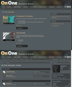
On One Animation School

Panupat

Well-known member
logo.og.png


http://ononeanimation.com/board/

The website is still heavily under construction ^-^

On One Animation School. We are a computer graphic school taught by professionals. Despite our name, we have nothing to do with On One Software who created Photoshop plug-ins.

I open up the forum for testing at the moment. Most of the forum you see will be invisible once it goes live. The forum is meant to be used privately for students and instructors to post assignments and give feed back. Using the word "board" instead of forum because that's what my boss wants.

The host is in Thailand, so, apology if the site is slow for some of you :oops:
 
Very nice style you have! I like it very much, except the post icons.. please do something original there :)

The layout seems great, and it is a very easy on the eyes dark site.

Nice to see someone who understands that dark doesn't automatically mean black ;)

Nice work!
 
I agree with the comments above. Nice style which is easy on the eye for a dark scheme, but you'd benefit from changing the speech bubbles :)
 
Trying to come up with an idea, I want to hint that the school has a lot to do with computer graphics and 3D stuff.

First idea, using a character in our short film, showing him as wireframe for read : render for unread
 

Attachments

  • idea1.webp
    idea1.webp
    17.7 KB · Views: 3
Seriously good idea Panupat! :D

they look excellent, are are so much more relevant to your site content! :D
 
Great site.
:)
How do you like Contao (aka Typolight) ?
Why did you choose that over Wordpress ?
Great skinning of Contao + Xenforo ... the visual integration is seamless.
Was the skinning hard ?

ononeanimation.contao.typolight.CMS.nice.skinning.webp

Suggestion: The tab should appear hightlighted when it is clicked.
In my drawing I simply made a red box around the tab to make it obvious which pages were in the screenshot.
When you hover over the tab the text turns orange. Even leaving the orange when you've clicked it would help.
 
Kim - my boss wants me to use a different character, working on it right now. xD

Doctor - thanks for your feed back. I'll play around with :active css and see what I can do. I'll have to see if I can figure a way to mark "current" page in Contao.

For the back end, wordpress is still superior for posting new content. Easier to manage and categorize imo. But Contao gives a much easier way to pull things to show where you want, the way you want.

For example. You create a news category called "Events". You then create instances of the "news list" module and give them different settings.

Say, I created 3 instances of "news list", tell them to receive data from "Events"
A - 5 most recent Events, title and date only
B - 1 most recent Events, with partial content and image
C - 3 most recent "featured" Events, with thumbnail.

Now I can assign A to my sidebar, B to the top of my homepage, C to the middle of my homepage.
Contao even gives you an easy system to give each modules different templates. Total control of how you want things to look.

Contao also come built-in with a very nice sandbox which saved me a lot of time. Too bad it uses moo-tools instead of jQuery D:
http://ononeanimation.com/ta_chanon.html

Great skinning of Contao + Xenforo ... the visual integration is seamless.
Was the skinning hard ?

The skinning was much easier than I thought on Xenforo. Contao took me a while to figure out how the system works xD
A lot of them are manual coded. It's a lot of work because I have to manually edited the HTML for every links. But my web's content probably won't need much change to the navigation tab, so it is a 1 time thing. I hope.
 
I like it, nice youtube and facebook icons used in the navbar and like the bubbles in the logo, all comes together very well. Shame twitter only offer blue as button colour choice because it spoils dark themes displayed on them.
 
Top Bottom