New Year's Day [Deleted]

Status
Not open for further replies.

Amaury

Well-known member
Amaury submitted a new resource:

New Year's Day - A style based on New Year's Day!

New Year's Day contains a total of 25 template edits. However, I won't bore you with the details. If you'd like to see which templates were edited and what changes were made, use the "Customized Components" and "View Change History" features.

LJA9xmY.png

Read more about this resource...
 
I'm not sure what to even say, this is just really ugly looking, bad color choices, nothing unique style wise about it. Not sure how it is even "New Year's Day" themed?
 
To be honest, it just looks half finished.

I don't want to be rude, and I'm not a professional designer myself, but I wouldn't release a sub standard effort when there are many stylers who put a considerably large amount of time into producing styles that aren't based off the default style.

You made an effort though, which is what counts.

I spent a lot of time on this, actually, most of it relating to template edits to change a controlling style property for something, to increase font size, to remove box shadows, etc. For example, I edited member_view.css to increase the font size of the user status timestamp from 9px to 11px to match the user status text.

Also, my styles are intentionally based off the default style. They're not supposed to be anything super fancy, just basic.
 
Also, my styles are intentionally based off the default style. They're not supposed to be anything super fancy, just basic.

I will honestly say (with all due respect) that this styles tones are not what I expected when I seen your icon or skin title. I was thinking confetti, lights, action, etc. Instead I was faced with a poor gray color & what looks like text that was highlighted by the highlight bbcode. I am having a hard time thinking as to which forum this type of theme would be suited for. This would not be a theme for any forum that wishes to remain "professional".

If basic was what you were going for, you unfortunately hit the mark.... for the new year of 1996 :unsure:

The icons don't necessarily reflect the type of style. If you take a look at my another styles, you'll see that. :)

Thanks for the feedback!
 
The icons don't necessarily reflect the type of style. If you take a look at my another styles, you'll see that. :)

Thanks for the feedback!

Correct. As apparent with most of the modifications but it looks like there was more time spent on the icon than the theme itself.

Although most or your other themes icons match your theme:

Example:

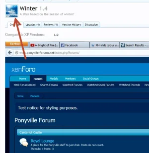
winter.webp
 
Correct. As apparent with most of the modifications but it looks like there was more time spent on the icon than the theme itself.

Although most or your other themes icons match your theme:

Example:

View attachment 64550

All the ones that match are just a coincidence, oddly enough. :p

No time is spent working on icons, actually. I just search Google for "Winter," for example, pick an image I like and re-size it to 96 x 96.
 
Best of luck to you & your future designs.

Thank you.

Going by votes, the majority of my styles seem okay, especially the dark ones, it's just some of the lighter or brighter styles that seem to be not as good to some people.
 
As a consumer of products & one who RARELY changes themes, you are great for giving away your hard work. I nor no one else has the strict ability to be rude or pass judgement on your themes because it does not fit our needs. If you were selling this theme for $20 I would have certainly came here & told you why that is a bad idea. I feel my criticism was fair & hope you didn't take it too harsh.

As you indicated, your themes are meant to be bare bones for lack of better words. This you have achieved. I personally think the target was missed on the color choices. I see that you were referencing a gold + Grey concept but think the gold is more yellow & the grey is too flat.

The problem you have is that some of the many themes (including the one I use on my site) come with "stylers" that allow us (& the members) to customize many color aspects of the forum. I have never been a fan of dark themes myself so of course I never commented on them. I think (in my crazy head) that light themes are where it's at professional but have seen a multitude of professional dark sites.

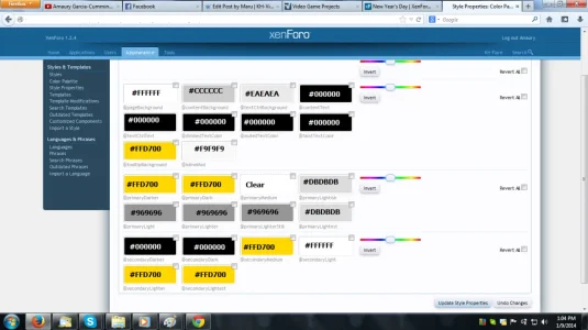
I got the exact codes for the gray and gold here. #808080 for the gray and #FFD700, but I would be more than happy to adjust them a bit. (However, I just realized I used #CCCCCC for the gray for some reason, so I can give the #808080 gray a try.) By all means, feel free to suggest a more gold and gray look. I have all the individual style properties pulling the styling from the color palette, so all I have to do is change the color palette colors, and bam!

For anyone that's curious, this is the color palette (I added the hex codes myself):
New Year's Day Color Palette.webp
 
Amaury updated New Year's Day with a new update entry:

Adjustments and Fixes

  • Styled "Draft saved" notification
  • Styled the suggested usernames dropdown
  • Fixed hard to see text on the Sign Up Now! button
  • Adjusted @textCtrlBackground, @contentBackground, @primaryLightish and @primaryLightest

There are now a total of 27 template edits, so I will update the OP accordingly, as well as update the screenshot.

Read the rest of this update entry...
 
Hello Amaury, I see your style has received 3 bad ratings and you are asking for constructive criticism. Perhaps I can give you some. When people criticised your style they criticised your poor color selection. The yellow you used is too dense and bright. With grey as your background color it's very distracting. Just imagine you read a newspaper with a candle always in your sight. Doesn't it distract you from reading? Then you use black text on a grey background. This looks very boring. Hyperlinks are all in dense blue and seem out of place on a grey background. The plain white on the outside doesn't seem right. It should be darker than the inside in a light style.
Last but not least the name choosing doesn't seem to be fitting. New Year's Day should be something positive, something that represents happiness, like a fresh spring day. Yours rather represents a sad rainy day or a graveyard, but with this yellow that seems again so much out of place.

  1. According to the hex code I have (#FFD700), what you call yellow should be gold. What would you suggest for a more gold look?
  2. As for the gray, that's actually silver (#C0C0C0), but it does have gray shades in it. What would you suggest?
  3. What colors would you suggest for text and links?
  4. For the page background, how about a dark blue?
Also, for reference, I didn't just randomly pick colors, I searched what colors fit New Year's Day and got this.
 
According to the hex code I have (#FFD700), what you call yellow should be gold. What would you suggest for a more gold look?

gold.webp

Gold may not necessary be achieved by one flat hex cod. For the best gold look you may need a variation as I just provided. Most sites with "gold tags" often end up with orange or yellow match rather than gold.
 
@Amaury don't let the remarks that are left without any suggestions bother you. At least you are attempting, and you are learning. That is how it starts. Not everyone starts off with the greatest, simply most amazing theme ever. It's simply not going to happen.

Work on your colors, as suggested above. Try to get some small tweaks in other areas to sort of highlight certain things. If you are looking for some great color coordination to use, simply look at places such as this: http://www.colourlovers.com/palettes

Search whatever you'd like. It's a start, and as a few above have stated, you will start seeing the difference in the shades you have chose, and ones that "match" a bit better.

Again, don't worry about the feedback that doesn't help at all. I give you props, I'd certainly never release my themes here after seeing some of the comments left.
 
View attachment 64610

Gold may not necessary be achieved by one flat hex cod. For the best gold look you may need a variation as I just provided. Most sites with "gold tags" often end up with orange or yellow match rather than gold.

Then they probably shouldn't be calling that gold. :p

@Amaury don't let the remarks that are left without any suggestions bother you. At least you are attempting, and you are learning. That is how it starts. Not everyone starts off with the greatest, simply most amazing theme ever. It's simply not going to happen.

Ironic that this is my ninth style release, and it's the first one to really get criticism.

Also, it's not so much that it bothers me, but I just can't work with comments that are simply "your style sucks!1!1!" and provide nothing constructive. "I think that's a good start, but I don't think these two colors go too well with each other. I think these colors would go well with each other." would be a much better comment.

Work on your colors, as suggested above. Try to get some small tweaks in other areas to sort of highlight certain things. If you are looking for some great color coordination to use, simply look at places such as this: http://www.colourlovers.com/palettes

Search whatever you'd like. It's a start, and as a few above have stated, you will start seeing the difference in the shades you have chose, and ones that "match" a bit better.

Where do I get the hex or RGB codes? I'm not seeing any. That orange under Weekend Trip looks like it'd make a good gold.

Again, don't worry about the feedback that doesn't help at all. I give you props, I'd certainly never release my themes here after seeing some of the comments left.

Thank you.
 
Status
Not open for further replies.
Top Bottom