Style New Horizons - Dark Style (W.I.P)

Shelley

Well-known member
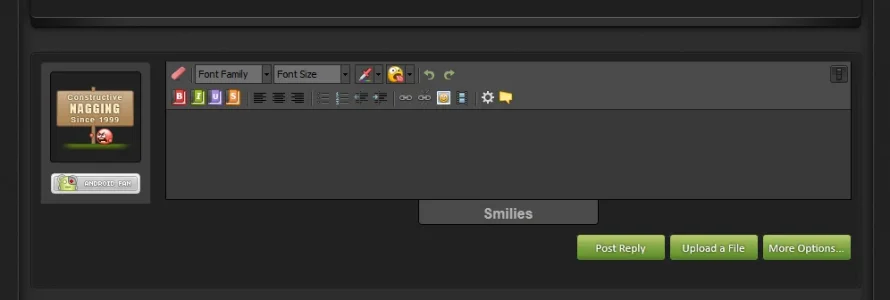
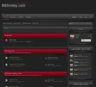
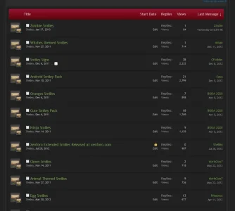
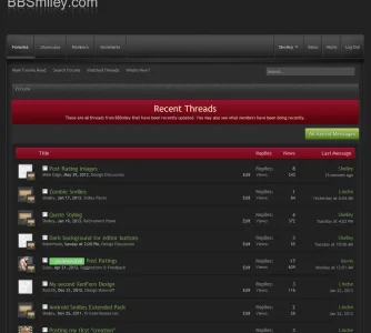
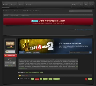
This is a Dark style i've been working on and off for a while now and going back to it when I can. I've did some enhancements to various areas (Editor, Navigation etc) and was looking for some feedback, suggestions what can be improved whether that would be colour changes, design changes etc.

It's the first dark style I've probably focused on and aiming to complete but haven't decided what I'll be doing with it yet (thinking of starting a L4D site) but that is yet to be decided. There are still many areas that need finished so I am aware of areas needing fixed it more to have a fresh pair of eyes critiquing it.

Thoughts, feedback appreciated, be harsh I can take it. :P
 

Attachments

  • editor_newhorizons.webp
    editor_newhorizons.webp
    10.6 KB · Views: 76
  • forum_list_NewHorizons.webp
    forum_list_NewHorizons.webp
    50.7 KB · Views: 77
  • forum_view_NewHorizons.webp
    forum_view_NewHorizons.webp
    49 KB · Views: 74
  • new_posts_NewHorizons.webp
    new_posts_NewHorizons.webp
    54.5 KB · Views: 72
  • thread_view_NewHorizons.webp
    thread_view_NewHorizons.webp
    71.9 KB · Views: 77
Whaouuu...
I don't usually like black themes but this one is nice. I really like the the dark red & light green association.
In your last thumbnail is it a particular addon with tabs or just a picture with "Left4Dead2"?
 
Love it Ms Shelley!

Really beautiful work as always! :D

Constructive critique...

I think the red is slightly not right, would have to see it live to give you an exact thought on it.

The box with the notifications in... really not digging the big image drop shadow, I personally am over that look, so might be just me being jaded, but I think it has been done myself, I would prefer something either simpler, or more modern.

That same box, or the one with the Recent Topics written in it, seems to be very big for the info that is contained in it... perhaps it is just there to show you can have one, or not sure what it is, but if it is a title, it seems too big to me.

Quality theme though, and I know many will be thrilled to have a theme of yours, and a free theme at that!!!
 
Actually saw the large versions of these screenshots, and the red is fine, just looked dull in the smaller versions, but full size it is fine, so disregard that comment :)
 
  • Like
Reactions: vVv
Whaouuu...
I don't usually like black themes but this one is nice. I really like the the dark red & light green association.
In your last thumbnail is it a particular addon with tabs or just a picture with "Left4Dead2"?

That is a screenshot image. :)

Love it Ms Shelley!

Really beautiful work as always! :D

Constructive critique...

I think the red is slightly not right, would have to see it live to give you an exact thought on it.

The box with the notifications in... really not digging the big image drop shadow, I personally am over that look, so might be just me being jaded, but I think it has been done myself, I would prefer something either simpler, or more modern.

That same box, or the one with the Recent Topics written in it, seems to be very big for the info that is contained in it... perhaps it is just there to show you can have one, or not sure what it is, but if it is a title, it seems too big to me.

Quality theme though, and I know many will be thrilled to have a theme of yours, and a free theme at that!!!

The h1 titlebars? Yeah I have to agree they are a little big I'll work on that to lower the size which won't be difficult since it would be lowering the font and reducing some padding. I quite like the shadow myself (even got it expanding for the toggle in some areas). Though size, I have to agree kim i think that can be worked on a little to reduce that, I was giving this more space than it actually really needs. But I think I'll work on that some more because I did ask someone before if it were too much and they said no, but i thought it was so your critique has confirmed what I felt a while back.

Thanks for the feedback Kim very much appreciated and I'll see if i can work on that/those areas a little. :)
 
No probs Shelley, I think it is a Win of a theme, few minor tweaks is all! :D

Deserves a Maple Bacon Cupcake on the strength of it!!!

maplebacon3.jpg
 
No probs Shelley, I think it is a Win of a theme, few minor tweaks is all! :D

Deserves a Maple Bacon Cupcake on the strength of it!!!

maplebacon3.jpg

Kim just didn't do this? Kim!!! KIM!!!!! I WANT MY CAKE, NOW!!!!!!! *stamps feet* off to the kitchen i go... Jeeez that looks nice. hmmmmmm! :p seriously, I am now rather peckish.
 
hehehe sorry, that was a bit mean really :p

I would seriously bake you a batch if I could :)

I posted those on the baconforum btw :p
 
Did a re-size of the titlebars @Kim but i kept the shadow since I like this though i could tinker with it and lower the height but overall the shadow is something I think will be kept. As for the size I think i shaved off 30% off the height.

titlebar_resize.webp
 
That does looks better I think Shelley!

I am never going to love that shadow feature tbh, but I am sure most people will :) I'm just jaded after doing styles like that for so long LOL!

These days I am in love with clean and simple - so ignore me :p You absolutely should do what you want to do! :D


Did a re-size of the titlebars @Kim but i kept the shadow since I like this though i could tinker with it and lower the height but overall the shadow is something I think will be kept. As for the size I think i shaved off 30% off the height.


Here's my contribution:-
(yes I did make them :p)


Nice work! :D
 
You know how I feel about this, Shelley. ;) You don't need an L4D2 forum...there are better uses of this style! :p
 
Dark+Blue version would be great. :)

There won't be any other colour variations I'm afraid. Sorry. The thread is to accumulate suggestions for the style colours that are currently existing (screenshots). To not mis-lead, this style is not being released it may be used on a project I might have planned.
 
That does looks better I think Shelley!

I am never going to love that shadow feature tbh, but I am sure most people will :) I'm just jaded after doing styles like that for so long LOL!

These days I am in love with clean and simple - so ignore me :p You absolutely should do what you want to do! :D


Nice work! :D

Okay back again. :P I couldn't stop thinking about the drop shadow you brought up earlier that I introduced, and I know it's there on forum_list, alot. So usually when you touch upon something it's good to follow good advice but I also wanted to replace the shadow effect for something that screams out you made a fairly nice enhancement. In the screenshot the shadows aren't removed but they will/may soon be if i decide to go the separate nodelist li route.

You'll notice the blending where the 3 part headers is slightly out where they join the forums (that will be corrected) if it all falls into place (shadow removed) headers (re-designed) but just wondering what your thoughts were about that Kim. :p

I've got some ideas on the category area (it'll need a re-design) but we'll see how the modded forumlist goes and hopefully eliminate the shadow, bright read headers possibly for something more integrated/seamlessly joined if that makes sense.

modded-forumlist.webp
 
Okay back again. :p I couldn't stop thinking about the drop shadow you brought up earlier that I introduced, and I know it's there on forum_list, alot. So usually when you touch upon something it's good to follow good advice but I also wanted to replace the shadow effect for something that screams out you made a fairly nice enhancement. In the screenshot the shadows aren't removed but they will/may soon be if i decide to go the separate nodelist li route.

You'll notice the blending where the 3 part headers is slightly out where they join the forums (that will be corrected) if it all falls into place (shadow removed) headers (re-designed) but just wondering what your thoughts were about that Kim. :p

I've got some ideas on the category area (it'll need a re-design) but we'll see how the modded forumlist goes and hopefully eliminate the shadow, bright read headers possibly for something more integrated/seamlessly joined if that makes sense.

View attachment 39929


I like the 3pc headers and footers very much! looks really sharp and clean!

I do think the NodeTitle is a bit too big though, would love to see it without the very big drop shadow :p I know you said you are still debating and redesigning, so I won't say too much about that :)

Like where you are going with this Shelley!

Will be getting you to critique a site for me if you don't mind too, but not quite yet, still working on it! :p

when ever your ready but knowing your style it'll be perfect and i won't find anything out of place:)

Yeah regarding the drop shadow on the headers I am starting to think they are going to go. and the big category, that looks like definitely going in the bin also :P but don't hold back, the shadows are prity damn big and I'm kinda glad a fresh set of eyes noticed this. I did kinda add another box shadow to the outside of the nodelist li (like i did with the thread_view) :P I swear when it comes to this flat design I'll fail miserably, but i felt introducing the shadow was consistent with the thread_view design around the messages and it brought out the nodelist a little.

I also fixed that slightly off colour because it was bugging me where the 3 piece heads joined.

Anyway, as always thanks again Kim :)

modded-forumlist.webp
 
Top Bottom