New forum, and trying to decide on a dark or light style

What kind of style do you prefer?

  • Dark, always

    Votes: 1 3.4%
  • Light, always

    Votes: 12 41.4%
  • It depends on the site

    Votes: 16 55.2%

  • Total voters
    29

Jesepi

Well-known member
I would prefer my site to have only a single style, so it is either going to be one or the other.

I guess it would help to know the demographic that my site appeals to, but being completely new... I have no idea. I would also not dare to make any assumptions, as the internet is very good at grinding those to dust.

The focus point of this forum is going to be consumer related , in terms of new products on the market and people's thoughts on them after buying. Should I try to match the colors used by places like newegg and amazon? I notice that xenforo already is doing that out of the box with the use of oranges, blues, and white. Is there some sort of psychological effect I need to be aware of? o_O

I'm leaning towards a lighter theme, but I'm open to suggestions for both, and the reasoning behind it.
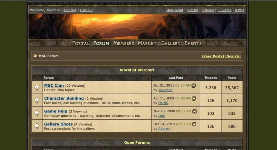
 
Both. :p

Light styles are too harsh on the eyes. Dark styles are better, but I don't like white text on a dark background. So when I developed my style I struck a balance between the two:

Screen shot 2012-01-14 at 7.49.08 AM.webp

It's a dark style with black text. Just an idea...
 
Not a fan of dark styles. Something bright like the default XenForo style is ok and although it's not perfect, it does have a nice appeal to it.
 
every forum i have ever run has had members that prefer one over the other. if i have a light style there will be users saying its too bright and requesting a dark option. if it is dark there will be users complaining it is too dark for their monitor or whatnot.
is there any reason you are opposed to running two styles?
 
You really really have to look at who your users are.

Mine love my bright pale style while another site is mostly happy with dark.
I would not expect it to be 50/50 as your members will have a profile - a character or personality collectively.
There is something/ or lots of things they have in common - thats why they come to you!

What kind of products are you focusing?

There can be a tendency for young users to love dark on dark - they see it as dramatic, and powerful where many older users see it as dingy and find it hard to read on dark.
Older users like stronger contrasts - eyes degrade after 40.
In principle always use a strong contrast text on background and dark on pale is the easiest to read. What is drama in design can often be hell to actually use.

But you really must fit it to your users. I might get 90% of users here saying my design is rubbish. Doesn't matter because it works for MY users.
 
Light styles are too harsh on the eyes. Dark styles are better, but I don't like white text on a dark background.

Agreed. Though I have noticed that once I get used to a site, it isn't as much of a bother as the initial shock of a too-dark or too-light style. I ran a dark style for one board, and tried making it slightly lighter, and the users almost went rabid on me.

is there any reason you are opposed to running two styles?

Just maintaining both, and having two styles opens up the chance of someone using a font color that will be disturbing to someone using a different style. Having a single style ensures everyone is on the same page when it comes to how things look.

You really really have to look at who your users are.

Agreed, though the curse/blessing in this instance is I have none of those yet, as it is a completely new site.

After thinking on it some more, I believe I will be going for more of a lighter style for this site. Thanks for the feedback, it was appreciated.
 
Just maintaining both, and having two styles opens up the chance of someone using a font color that will be disturbing to someone using a different style. Having a single style ensures everyone is on the same page when it comes to how things look.
there is no maintenance if the dark style is a child of the light style. any template modifications to the light style would also be reflected in the dark style.
i overcame the problem of colour-formatted text by removing it from xf (see sig).
another option is to use a single middle-ground style. my default style is essentially the stock xf style with the brightness dialled back.
 
Mid Toned!

I can tell you from almost 9 years of doing forum themes that the light themes sell 10:1 over dark - but that does depend very much on your site and demographic.. younger people like dark more than older people do.. gamers like dark more than gardeners etc.. so know your members is the key.

Mid toned skins that are not too light, nor dark, in the tonal range of the one Jake included here are perfect for me.. but might be too dark for some.. I find the default XF skin wayyy too light for my eyes.

Good luck with it regardless of which way you go :)
 
Lean towards preferring light styles. The only sites where I see a lot of dark styles that I like are gaming sites. Otherwise, I would tend to think "lighter" is better. That's IMHO.
 
Personally I prefer light sites. BUT. What genre is your forum?

For example, gaming forums tend to go for a darker theme, but something like a generic chat site would go for a light theme.
 
Well I'm experimenting with the light style on my other site FilmSchool.org.

Studentfilms.com is rocking the dark style and I like it on that site. I go back and forth about the light style I'm trying out on FilmSchool.org. Still seems too bright.

What do you guys think?
 
Top Bottom