• This forum has been archived. New threads and replies may not be made. All add-ons/resources that are active should be migrated to the Resource Manager. See this thread for more information.

New design sneak peek

Status
Not open for further replies.

John

Well-known member
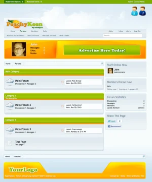
Hello all! I have a new design that's far enough along to give you all a sneak peek of the working version (the navigation area has yet to be styled and will be quite different than the standard layout). PeachyKeen should be ready soon however on the flip side, I am putting a lot of extra effort into little details that hopefully will enhance the fun of using XF...which means that it's taking a little longer than originally planned (hopefully it will be worth it lol).

Look forward to and appreciate all feedback :)
peachy.webp

Screen shot 2011-01-30 at 1.07.12 PM.webp
 
Looks great John :), love the creativity involved can't wait for the release. My one critique on the design would be to push the entire design up, a bit much space between the Peachy Keen logo and the top user bar. Great job though.
 
Another excellent design John.

I do have to agree with Russ about the space, but otherwise I do like the layout and you know I love the bright, cheery colors.
 
Hello all! I have a new design that's far enough along to give you all a sneak peek of the working version (the navigation area has yet to be styled and will be quite different than the standard layout). PeachyKeen should be ready soon. Look forward to your feedback :)

View attachment 10150


Love the colours, not so keen on the big chunky Angled vB style graphics top and bottom, but the colour combination is really fresh and lovely :)
 
I agree with kim on this. The colours are refreshing and coming to the same opinion I feel the angled imagery located in the header & footer throw things off a little.

Nice work john, looking forward seeing this style in the flesh.
wink.png


ps. Any chance we can get a sneak peek at the postbit areas?
 
Thanks for the kind words and feedback so far everyone! I agree the space in the header is a bit much, I'll be working on that ;) On the angled imagery, it does look out of place somewhat now but I have plans for those area's that aren't coded into the preview yet that will make it more visually appealing and make more design sense once you see it.

@Shelley, the postbit area's aren't far enough along to give a preview of yet. I am experimenting with some graphics in place of text for functions in the postbit...here is a shot of that:

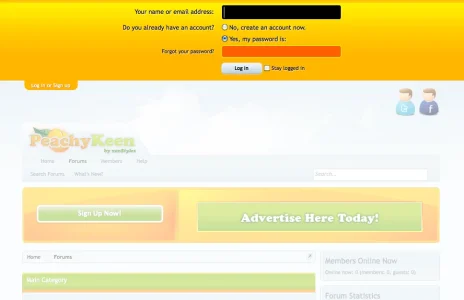
Screen shot 2011-01-30 at 10.23.26 AM.webp

@Junior, here is a view of what the navigation will look like in the header:

Screen shot 2011-01-30 at 10.23.10 AM.webp
 
Thanks for the kind words and feedback so far everyone! I agree the space in the header is a bit much, I'll be working on that ;) On the angled imagery, it does look out of place somewhat now but I have plans for those area's that aren't coded into the preview yet that will make it more visually appealing and make more design sense once you see it.

@Shelley, the postbit area's aren't far enough along to give a preview of yet. I am experimenting with some graphics in place of text for functions in the postbit...here is a shot of that:

View attachment 10161

@Junior, here is a view of what the navigation will look like in the header:

View attachment 10162

Those screenies are looking really nice. Can't wait to see this style. Excellent work john, as always. :thumbsup:
 
that is a nice style.. I really like it.. Although i tend to agree with most of the constructive criticism.. This would rock on one of my forums..
 
It's nice to see that someone is actually working on a professional design, instead of a lame recolor with a few image changes. Of course there are a few (somewhat) professional designs already, but the majority are not. I look forward to seeing the final product.
 
do you have any plan to release this to the public, heck i would even buy that skin
Yes, this will be released on my site as a paid offering ;) Just as an FYI, the little 'nook' in the footer image will also be a banner space for smaller banners such as 88 x 31. The banner area's will be coded so that they are easily managed by the admin.
 
Who had the idea first? :D
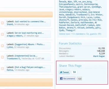
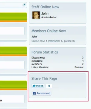
I did it on my own site when the FB & Twitter buttons were added to the main page. I think the guys here realized those buttons needed to be framed in the secondaryContent just recently ;)
 
I did it on my own site when the FB & Twitter buttons were added to the main page. I think the guys here realized those buttons needed to be framed in the secondaryContent just recently ;)

Exactly I made the suggestion to add a container which was initially refused and then added but before it was added here I created my own social block which I think many people did also.
 
Status
Not open for further replies.
Top Bottom