Jaxel
Well-known member
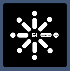
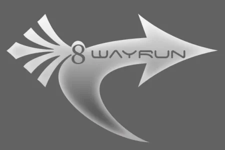
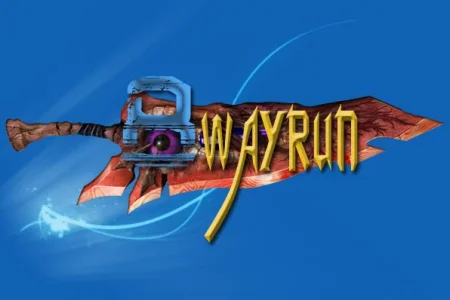
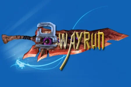
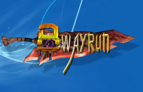
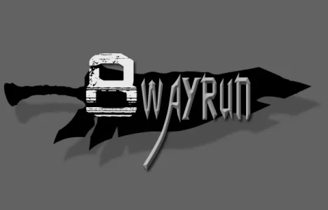
This is my current logo...
http://www.8wayrun.com/styles/exm-logo.psd

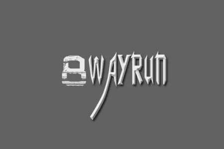
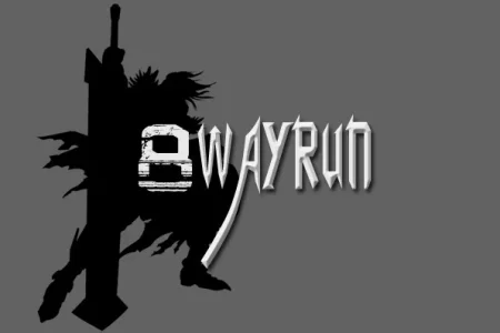
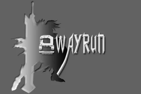
The problem with this logo has always been that its too complicated. Getting hats and t-shirts with this logo have been very expensive because of this. Does anyone feel like taking up the task in taking my logo and making it a bit more suited for distribution?
http://www.8wayrun.com/styles/exm-logo.psd
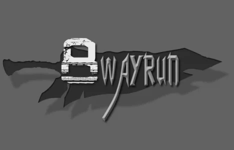
The problem with this logo has always been that its too complicated. Getting hats and t-shirts with this logo have been very expensive because of this. Does anyone feel like taking up the task in taking my logo and making it a bit more suited for distribution?