Nav Tab not following my css change

Neil E.

Active member
Code:
        <!-- no selection -->
        <xen:if is="!{$selectedTab}">
            <li class="navTab selected"><div class="tabLinks"></div></li>
        </xen:if>
 
    </ul>
 
    <xen:if is="{$visitor.user_id}"><xen:include template="navigation_visitor_tab" /></xen:if>
 
    <xen:if is="!{$visitor.user_id}"><ul class="visitorTabs"><li class="navTab NewLoginSignup"><a href="{xen:link login}" class="navLink visitorTabItem OverlayTrigger">{xen:phrase log_in_replace}</a></li></ul></xen:if>
 
</div>
 
<span class="helper"></span>
     
        </nav>
    </div>
</div>

This relates to my altered Log in or Sign up tab on the Nav Bar. This is a new tab via Jake's template mod. It is now the only way to log in and calls up the overlay. You can view it here as a guest: www.odsc.on.ca/.xenforo/index

xenforo31.webp

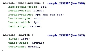
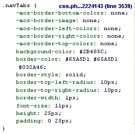
It inherits styling from class=navTabs
xenforo30.webp

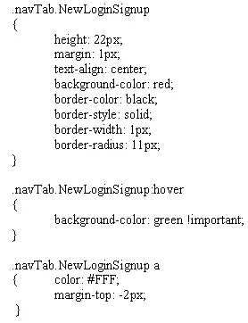
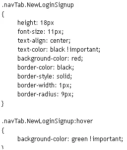
It should be styled from it's new class=navTab NewLoginSignup
xenforo33.webp

Inspecting it with Firebug shows:

xenforo32.webp

I'll set the final colors after some other forum styling is decided. My problem is that it's ignoring the black text and 18px height. Even adding !important doesn't help. What am I doing wrong? Is a specific order required for the sequence of the individual style attributes?

I'm trying to create an oval button that is slightly smaller than the Nav Tab height so the button border will be inside the normal tab height.
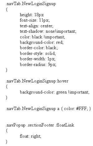
 
Good suggestion but I had it that way before as well. What's strange is that the image isn't really clear. It looks like there is an element in the same position that is also influencing the result. Kind of like a transparency. I don't have any other modifications to the navigation or navigation.css templates. It's acting as though some of the Nav Tab properties have priority over my css change. Button functionality is fine but the appearance is poor. I'm using this button to improve my knowledge of CSS/CSS3.
 
I think judging by the screeny there's some text-shadow? Could you provide a link?

try adding in
Code:
.navTab.NewLoginSignup {
text-shadow: none!important;
}

I'm quite sure that the login/signup is inheriting the text-shadow from the .visitorTabs
 
xenforo35.webp

results in white text which comes up crisper in the screen capture:
xenforo34.webp


The code addition changes the color of the link which must be more significant than trying to change it as text.
 
Right, black was my original choice. Russ had the idea to change the link attribute to white (which works). Must have something to do with the text being called via a phrase. There is so much code involved with the navigation bar that it must be the most intense location for styling.

Since the main issue is about appearance, can anyone suggest a different method of putting a button in that location? Is there a preferred way to do it? I'm still wondering about the placement too. I'd like to get it a bit shorter vertically so it's noticeably within the Nav Tab.

@Shelley I don't see any text decoration or shadow properties assigned to the Nav Tabs. There is a shadow for Selected Tab, but that shouldn't apply to this "closed tab" button. The visitor tabs only display after a successful login.
 
Russ,
Thanks, you're right on the money. I can see the margin difference right away. That plus the link color has nailed it. A bit more testing and I should be fine. This has been a good exercise for learning the detail stuff.

EDIT: I'm not a smilie fan but I'll put one here ;)
I'll adjust the final colors later on.

xenforo36.webp
 
Top Bottom