Enigma
Well-known member
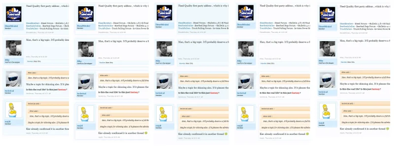
I was pondering the idea that we need more distinction between posts, which would help users see who wrote what and to differentiate between post content (valuable) and signatures (no so...) by being able to see where a post begins and ends.
Anyway, I got to messing around. What do you think? I've linked to the original screenshots and attached a side-by-side comparison of all 5.
#1 — Full border with bg fill — http://i.imgur.com/q112j.jpg
#2 — Full border with outer glow — http://i.imgur.com/5r16o.jpg
#3 — Message content border bg fill — http://i.imgur.com/nS1K4.jpg
#4 — Message content border no fill — http://i.imgur.com/cNZvA.jpg
#5 — Original (for comparison) — http://i.imgur.com/z6tsN.jpg
I like #4 the best.
This is not a criticism of the current style, which I like. I was just messing around and exploring ways to be able to differentiate between posts better.
Attachments
Upvote
2
