Mock Mobile View Layout

erich37

Well-known member
Since we have several styles here, like e.g. a "Fixed Width Style" and also a "Kitchen Sink Style", etc. ; I was just thinking of having a few styles which would mock of how the website looks like on different mobile devices.

Not sure if it makes sense or whether it is possible, but it would be cool to select a style here at XenForo.com to see how the website would look like for example on an iPhone.
So literally make a new style which will have the screen-width of an iPhone in portrait-format and another style having the width of an iPhone in landscape-format.


So we could sit on our desktop-computer and view how XenForo.com looks like on a small-sized screen.


Thoughts ?


:)
 
A lot of effort for no real gain as there's no such thing as a "mobile" style any more. Resize your browser to iphone dimensions and you have an "iphone style".
 
A lot of effort for no real gain as there's no such thing as a "mobile" style any more. Resize your browser to iphone dimensions and you have an "iphone style".

It would not be that much effort to create a new style with just another page-width.

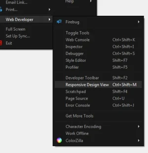
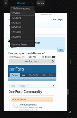
Yeah, probably it makes more sense to change Browser-resolution-size to "mock" the behaviour.....
 
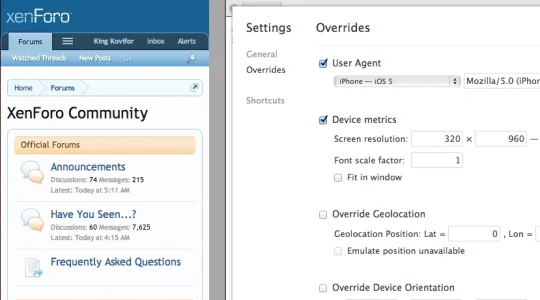
Chrome also has easily accessible overrides (right click, inspect element. Gear Icon in the bottom, overrides):
Screen Shot 2013-07-09 at 4.24.16 PM.webp

Changes the viewport width / height to match that of the device you are emulating.
 
But all the responsive elements work based on your browser window size. Setting the page width to be a certain value isn't the same is it?

it would not be exactly the same as on a real mobile device.
it would just be some sort of "simulation" or "synthetic view", so you could just quickly view it with the exact page-width dimensions and how it would "approximately" look like an an iPhone or Android or a certain tablet, etc.
 
it would not be exactly the same as on a real mobile device.
it would just be some sort of "simulation" or "synthetic view", so you could just quickly view it with the exact page-width dimensions and how it would "approximately" look like an an iPhone or Android or a certain tablet, etc.

But none of the responsive elements would react as while your page width might be 300px, your browser window would still be 1000px or whatever.

I don't know if that's correct but I assume that's how it works.
 
it would not be exactly the same as on a real mobile device.
it would just be some sort of "simulation" or "synthetic view", so you could just quickly view it with the exact page-width dimensions and how it would "approximately" look like an an iPhone or Android or a certain tablet, etc.
Use the overrides in Chrome. I know Safari has something similar as well (I believe).
 
But none of the responsive elements would react as while your page width might be 300px, your browser window would still be 1000px or whatever.

I don't know if that's correct but I assume that's how it works.

well, it was just an idea I had.
It probably does not make any sense at all :D
 
Back
Top Bottom