Members recently online

Members recently online [Paid] 3.0

No permission to buy ($35.00)
Currently, yes. It will show all. We are begging Andy to adding the functionality to truncate the list at "x" users. I hope he does so.

He is asking why not just reduce the time frame... in order to make the list shorter? But for some of us, the ability to show a total for how many members have been active on the site in the last 24 hours is a big deal...

I'll just hop in and reiterate the same request.
With growing boards you always want the sidebar info to look full and useful.
You might fill the block sometimes and be dead others. This KILLS the crowd effect.
You can lengthen the time to keep that widget full but sometimes it'll be way too many.
You can shorten it for big boards, but that will mess up midsized boards with local traffic. They peak and fill for 8-12 hours then dead after that. New user arrives to no one online ghost town.

It would be great if this add-on had the overflow truncated to a max. There used to be a very simple add-on for 1.x that did this.


Thanks for considering.

Also chiming in that I've found myself wanting this, but it isn't available.
 
Also chiming in that I've found myself wanting this, but it isn't available.


Because of the significant variability and number of users and this expanding and shrinking my sidebar so dramatically as to change the look of my forum index, I have moved this add-on to the bottom of my forum index page.

My preference is to use the miniature avatars.
On the sidebar this can make a dramatic increase or decrease in size with not that many users. This forces the use of text which I don't think is as nice looking.

if you are doing the same, consider moving the add-on to the bottom of your forum index page.

Then if you're a smaller site, increase the time to maintain recent members online.


of course it would be quite nice to see the last 12 or whatever so the block remains the exact same size for design and can be put in the sidebar of those avatars. But until then, this is a decent work around that keeps the avatars loading below the fold on your page for speed reasons.
 
It already is on the bottom, and the number of users is just too large. This wasn't an issue for us on vBulletin since there was a separate online list page, so we could just delete all the user list data, and if anyone wanted to view the full list, they can just click from that page.
 
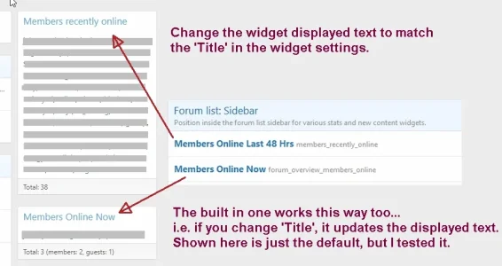
Love this mod! Thank you. Is there a way to have the widget 'display name' match the title in options?

membersonline frame in frame.jpg
 
Last edited:
Got an error to report. First time seeing this.

XF\Db\DuplicateKeyException: MySQL query error [1062]: Duplicate entry '1072' for key 'PRIMARY' src/XF/Db/AbstractStatement.php:228
Generated by: Dgtyupl Aug 25, 2020 at 3:51 AM

INSERT INTO xf_andy_members_recently_online (user_id, view_date) VALUES (?, ?)
------------

#0 src/XF/Db/Mysqli/Statement.php(196): XF\Db\AbstractStatement->getException()
#1 src/XF/Db/Mysqli/Statement.php(77): XF\Db\Mysqli\Statement->getException()
#2 src/XF/Db/AbstractAdapter.php(94): XF\Db\Mysqli\Statement->execute()
#3 src/XF/Db/AbstractAdapter.php(218): XF\Db\AbstractAdapter->query()
#4 src/XF/Mvc/Entity/Entity.php(1463): XF\Db\AbstractAdapter->insert()
#5 src/XF/Mvc/Entity/Entity.php(1195): XF\Mvc\Entity\Entity->_saveToSource()
#6 src/addons/Andy/MembersRecentlyOnline/XF/Pub/Controller/Forum.php(43): XF\Mvc\Entity\Entity->save()
#7 src/XF/Mvc/Dispatcher.php(350): Andy\MembersRecentlyOnline\XF\Pub\Controller\Forum->actionList()
#8 src/XF/Mvc/Dispatcher.php(257): XF\Mvc\Dispatcher->dispatchClass()
#9 src/XF/Mvc/Dispatcher.php(113): XF\Mvc\Dispatcher->dispatchFromMatch()
#10 src/XF/Mvc/Dispatcher.php(55): XF\Mvc\Dispatcher->dispatchLoop()
#11 src/XF/App.php(2190): XF\Mvc\Dispatcher->run()
#12 src/XF.php(391): XF\App->run()
#13 index.php(20): XF::runApp()
#14 {main}

array(4) {
["url"] => string(1) "/"
["referrer"] => bool(false)
["_GET"] => array(0) {
}
["_POST"] => array(0) {
}
}
 
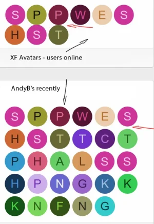
In your addon there is a margin-bottom to make distance for lines of avatars.
In the orginal view i dont have this distance.
Now your widget looks nice, the XF one not.
I dont see any differences in the source-code and i cant find that margin, but it must be somewhere.
May someone know this problem and has solved it?

avatars.jpg
 
Answer: Andy uses this one here with a margin-bottom of 4
.membersrecentlyonline-avatar a:link

but this means that we have two lines of code more per avatar.
i guess the margin could set easier with one css instead of so much more code.
 
I migrated form Vbulletin to xenforo recently. I purchased this widget and enabled 1440 minutes timeout and nothing happened. I checked and double checked all the steps than lowered the number to 240 and still my users time out at 60 minutes.
 
Never mind. Done it. I didn't realize "creating widget" translates to "add widget" in admin panel but I am dumb.

Also you have to edit widget "members online" than clear all "display in positions" boxes and save your settings. Otherwise you'll be running two blocks "members online" and "members recently online" simultaneously.
 
Back
Top Bottom