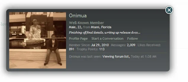
Fixed  member_card_stats1 / member_card_stats2 results in squished stats

Onimua

Well-known member
If you want to add another link to the member card, you end up squishing the stats section into an undesirable mass.

This is all I'm using in the template used for the hook:
HTML:
<th>{xen:phrase lnblog_entry_count}:</th> <td><a href="{$blogLink}" class="concealed">{xen:number $entryCount}</a></td>

blog_squished_stats.webp

Is there not a better way to do it, perhaps either making the member card more flexible width-wise, or change it so the added links appear underneath either of the two column rather than making a third?
 
If you want to add another link to the member card, you end up squishing the stats section into an undesirable mass.

This is all I'm using in the template used for the hook:
HTML:
<th>{xen:phrase lnblog_entry_count}:</th> <td><a href="{$blogLink}" class="concealed">{xen:number $entryCount}</a></td>


Is there not a better way to do it, perhaps either making the member card more flexible width-wise, or change it so the added links appear underneath either of the two column rather than making a third?
Not really, the member card uses an image background and isn't really intended to be extended unless you supply an alternative background image that accommodates the new data.
 
Hm... I guess a little EXTRA.css work might be in order for me then, but then I'm not sure what would happen if another add-on decides to do something similar and we end up fighting over the space and each try to provide our own styling. Or if permissions prevent the user from being able to see the extra info, then you end up with a bit of unused space.

Would it be possible to shift this over to suggestions then for maybe something to look at again down the road?
 
I've altered the layout and hook structure for the member card so it's a little more flexible now.
 
HTML:
<dl class="userStats pairsInline">
<xen:hook name="member_card_stats">
	<dt>{xen:phrase member_since}:</dt> <dd>{xen:date $user.register_date}</dd>
	<!-- slot: pre_messages -->
	<dt>{xen:phrase messages}:</dt> <dd><a href="{xen:link search/member, '', 'user_id={$user.user_id}'}" class="concealed">{xen:number $user.message_count}</a></dd>
	<!-- slot: pre_likes -->
	<dt>{xen:phrase likes_received}:</dt> <dd>{xen:number $user.like_count}</dd>
	<!-- slot: pre_trophies -->
	<dt>{xen:phrase trophy_points}:</dt> <dd><a href="{xen:link members/trophies, $user}" class="concealed OverlayTrigger">{xen:number $user.trophy_points}</a></dd>
</xen:hook>
</dl>
 
Kier,

I like the new design... to an extent. It allows for greater customization, but if you have more than 1,000 posts, "Like's Received:" and the number are on two separate lines. Possible add a two per line rule?
 
Possible add a two per line rule?
That basically takes us back to the original problem where there was no space available. The current solution is really the only way to allow that area to be extended. It's somewhat modeled on the new Facebook info summary at the top of profile pages.

Screen shot 2011-04-02 at 20.03.35.webp
 
Eh, never liked Facebook's design in that area. just asking, but could a CSS sprite be used for the top bar and bottom bar, and a repeating background allow for greater up/down expandability? I'm not that great with CSS, so that may be completely in the wrong direction.
 
I like the way it works now (I see the update as been rolled out). You'd have to have a decent number of items there before it starts to push past the bottom of the member card, so I think it's safe as I doubt there'd be any site with that many member card stats.
 
Wow the old one was much cleaner. I guess you can't satisfy everyone.

I agree King that part of the FB design update was horrible, one big clutter I want to avoid.
 
That basically takes us back to the original problem where there was no space available. The current solution is really the only way to allow that area to be extended. It's somewhat modeled on the new Facebook info summary at the top of profile pages.

View attachment 13402

wow, the image looks great!
Are the edit-Links a new XF-feature ?

Would be great to have this "Edit options" visible to the respective member only.
Maybe on each of his posts or underneath the avatar-image at the left of a thread..... ?
 
if a user did not enter his "location", what about having a link shown to this user (in the setcard) saying "Enter your location".
Same for gender and status-message.
This link will then forward to the members account-page.

not sure whether number of "Likes" and "Trophies" to show in the set-card is so important.... ?
Because the trophy is suppose to partially take the place of the profile, and the user info usually shown under your avatar.
 
I preferred the old way the member card was displayed, it's not very clean this way.
But then you have the issue presented in my first post., which I think actually looks worse.

It seems to be the only way to have better expandability for add-ons to use the space without jumbling it up.
 
the number for "Likes Received" is now breaking off into another line, which does not look good.

Why not have just 2 columns instead of 3 columns ?

number_breaks_into_line.webp

it looked much more organized previously.....
 
When you look at it now it just seems more like a big blob of text you know, where it used to be a more structured thing which you could quickly scan through. It has quite an impact.

If some solution for the best of both worlds could be found that would be great.
 
Top Bottom