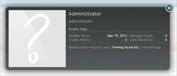
Member card stats and last activity in two columns

Member card stats and last activity in two columns

Paul B

XenForo moderator
Staff member
Brogan submitted a new resource:

Member card stats and last activity in two columns (version 1.0) - Two columns are better than one

This idea has been shamelessly stolen from digitalpoint, as per the thread here: http://xenforo.com/community/threads/member-card-redesigned.47751/

Simply paste the following code into EXTRA.css to change the existing member card design to have two columns with the stats on the left and the last activity on the right.

Code:
/* Member card stats and last activity in two columns */
.xenOverlay.memberCard .userInfo .userStats {
float: left;
width: 49% !important;
border-right: 1px...

Read more about this resource...
 
Just dropped in the CSS on our installation. Solid improvement, easier to read. Thanks digitalpoint Brogan!

This should be the default view for 1.2.
 
Edit: Ninja'ed

I didn't realise the timestamp had a separate class so that was also possible to do via CSS.
 
Excuse me, but original member card is much much better! Especially from point of view designer and readability.
In any case, thank you for your effort, Brogan. :)
 
Without a redesign of the whole member card, or dropping the background image, I don't believe it will ever be considered, due to the ability of dev's to hook into it and push the content out of the bottom.
 
First release of XF looked similar to this, they changed it to the more cluttered design that it is now to avoid layout problems when additional add-ons are installed. Not sure if DP thought of that first release design but just to point out he's not the first to introduce it.
 
First release of XF looked similar to this, they changed it to the more cluttered design that it is now to avoid layout problems when additional add-ons are installed. Not sure if DP thought of that first release design but just to point out he's not the first to introduce it.
I never saw how it looked in 1.0.0, I just didn't like how it looked in 1.1.x so I tossed some CSS at ours to make it something I liked better. I went through a couple iterations... first it wasn't spit with the "last seen", but it looked lopsided, then the stats were on the right instead of the left, but that looked weird too. Finally ended up with what you see now.
 
I did like the original layout but I recall it was changed after a bug report related to content breaking out of the bottom, due to an overly long status update message.
 
Top Bottom