You are using an out of date browser. It may not display this or other websites correctly.
You should upgrade or use an alternative browser.
You should upgrade or use an alternative browser.
Implemented Make "+" more visible!
- Thread starter TheBigK
- Start date
This suggestion has been implemented. Votes are no longer accepted.
Right now when you click the "+" it has a nice blue background. Can that be the default? Then when it's selected it has a green background to show it's selected? Just my thought. I expect cool theme developers to use FontAwesome to make things like purtty.
I'll probably go with Brogan's idea [+] [-] or a variation like [+] Quote, [-] Quote.
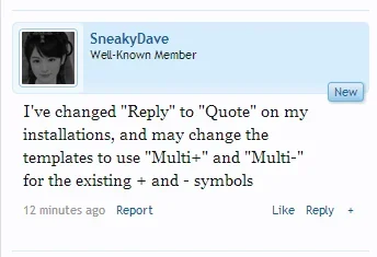
I've changed "Reply" to "Quote" on my installations, and may change the templates to use "Multi+" and "Multi-" for the existing + and - symbols
But [+] was MY IDEA!
Must have missed that because I saw you wanted to have it styled as a "button"
Must have missed that because I saw you wanted to have it styled as a "button"
[+] should look like a button!
I really like the way they done it, simple and minimalist. You don't want to crowd the page with lots of repeated text that will be present on every single post.
It should be easy to change the exact text if it's phrased and easy to style via css if you want it bigger. Remember they're also designing for tablets and small smartphone screens too.
If you have a whole word or even two words it can become cramped quickly, see the following image as an example, which doesn't even have the moderator controls visible. Space is a premium on smaller screens which more people are using.

As for people understanding what it means, I'd rather have it a minimalist + and perhaps an explanation in the forum help to show users how to use it. They'll get the idea quick enough.
Although it could possibly be nice to have some kind of feedback as to how many quotes you have selected after each click. Perhaps a moving bubble with a counter similar to the one that appears when a moderator uses the checkbox to select a post, this could be clickable to bring up the quote review box.

Or maybe that's not really necessary, just thinking out loud.
Adding a a remove all or clear button to empty your quote bank could be nice though. Is the insert into message the only way to clear it?
It should be easy to change the exact text if it's phrased and easy to style via css if you want it bigger. Remember they're also designing for tablets and small smartphone screens too.
If you have a whole word or even two words it can become cramped quickly, see the following image as an example, which doesn't even have the moderator controls visible. Space is a premium on smaller screens which more people are using.

As for people understanding what it means, I'd rather have it a minimalist + and perhaps an explanation in the forum help to show users how to use it. They'll get the idea quick enough.
Although it could possibly be nice to have some kind of feedback as to how many quotes you have selected after each click. Perhaps a moving bubble with a counter similar to the one that appears when a moderator uses the checkbox to select a post, this could be clickable to bring up the quote review box.

Or maybe that's not really necessary, just thinking out loud.
Adding a a remove all or clear button to empty your quote bank could be nice though. Is the insert into message the only way to clear it?
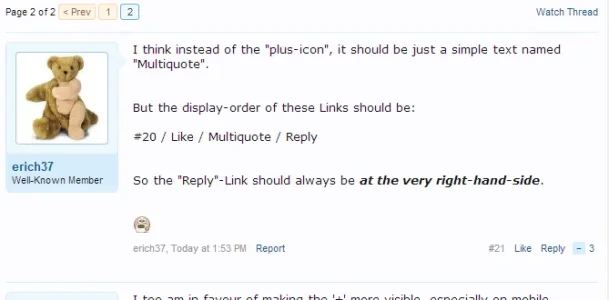
anyway, the "plus icon" should be "phrased".... so that anyone can easily change it wthout messing in templates.
http://xenforo.com/community/thread...ssorted-improvements.67121/page-3#post-705500

http://xenforo.com/community/thread...ssorted-improvements.67121/page-3#post-705500
Agreed!
Yea I can't wait to roll out 1.3 and include a magnifying glass for each of my members.
Tailor it to each of your target audiences. Yeah, all those over 60's on the cruising talk forum may need a bigger button, but do you really think the younger demographic on the football forum won't be able to see it and figure out how to use it? That's the great thing about xenforo, it's so flexible and easy to tailor your your individual needs.
Seems really odd that it isn't phrased though? Do we need to create a suggestion for it to become phrased? I don't understand why it wouldn't be if all the other post buttons are. Is there a benefit to not having it phrased?
Should just be a phrase that way you change it in one place no worries. Of course I said that before reading the thread and I see thats already in it. Obviously there is a difference between a suggestion for the product and a suggestion that also effects the usability of the customer forums.
I have kept Reply as Reply and I definitely intend to change + to Multi or Multi Quote which has me thinking of changing Reply to Quote.
I have kept Reply as Reply and I definitely intend to change + to Multi or Multi Quote which has me thinking of changing Reply to Quote.
Similar threads
- Solved
- Replies
- 6
- Views
- 48
- Question
- Replies
- 1
- Views
- 41
- Question
- Replies
- 7
- Views
- 148
- Replies
- 0
- Views
- 31
- Replies
- 2
- Views
- 48
