XF 2.2 make logo wider

UGTeam

New member
Hi, i was hoping someone maybe able to help me to make my logo wider so it touches the dark edge as per the attachment.

I am running Xenforo 2.2.10 and using a fully and completed re-designed theme that i fully own, so if it possible to make the logo wider then please help me with this issue.

Thank you in advance.
UGTeam
 

Attachments

  • aascroll.webp
    aascroll.webp
    67.5 KB · Views: 35
Just a suggestion, especially when dealing with a custom style. A LINK to the site is always beneficial. That way anyone looking at it can actually examine the CSS code instead of making a guess based upon standard CSS code on the default style. Sometimes, special CSS is added to a style.
 
Just a suggestion, especially when dealing with a custom style. A LINK to the site is always beneficial. That way anyone looking at it can actually examine the CSS code instead of making a guess based upon standard CSS code on the default style. Sometimes, special CSS is added to a style.
No guessing here, identified the site from the screenshot and went to it that way in order to verify css change would work as requested.

Hi bzcomputers it worked thank you very much, just one question how can i make the logo higher i need it to level up with the navbar.

I not sure exactly what you are asking here. Try the code below to see if it gives you what you are looking for. If not be a little more specific on what you want.

Update changed code above to this:

Code:
.p-header {
    margin: 0px;
    width: unset;
}
.p-nav {
    padding: 4px;
}
.p-nav-inner {
    align-items: unset;
}
 
No guessing here, identified the site from the screenshot and went to it that way in order to verify css change would work as requested.
I don't have a habit of looking at every attachment and then expending the extra effort to find a domain name then go to that site. If someone wants help on something like that, they can take the few seconds to link to their site. If it's not that important to them, then it's not that important to me to have to investigate to find their site to examine. That's why I suggested for future reference that when dealing with a non-standard style they link to the site itself. As I've gotten older, I value my time more.
 
Hi Tracy.
I thought i put a link to the site when i did the trhead, i am sorry i forgot to do it, old age catching with me i am almost 62 y/o and it's getting harder to remember things, so my appoligies.
Here is the link below.
 
No guessing here, identified the site from the screenshot and went to it that way in order to verify css change would work as requested.


I not sure exactly what you are asking here. Try the code below to see if it gives you what you are looking for. If not be a little more specific on what you want.

Update changed code above to this:

Code:
.p-header {
    margin: 0px;
    width: unset;
}
.p-nav {
    padding: 4px;
}
.p-nav-inner {
    align-items: unset;
}
ok i have added my site link above. What i am trying to do is with my logo at the bottom there is a rounded of area where i would like to place my navbar, but i think the issue is because the navbar has links inside when i try your code all the links move down away from the navbar but the logo doesn't go lower towards the navbar. I wanted the navbar to touch the logo and make look as one.
 
Not sure what the issue is but what I see and what you screen shot above are very different looking. If I gave you changes for one they would not work well with the other. This is what I currently see...

header.png

which is quite different than what you posted...

header2.png
 
i am slowly getting the site ready, can you see the gap from the logo to navbar the grey area, that'sthe area i want the navbar to fit in, or lower the logo so it fits with the navbar.

I don't know if the logo can fit behind the navbar.
 
Hi Tracy.
I thought i put a link to the site when i did the trhead, i am sorry i forgot to do it, old age catching with me i am almost 62 y/o and it's getting harder to remember things, so my appoligies.
Here is the link below.
I know the feeling... 59 myself...
I'll try to take a look at it also.
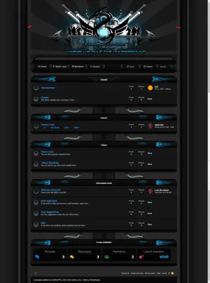
Looks like a UI.X style?

Are you talking about this rounded area?

Screen Shot 2022-10-09 at 8.11.42 PM.png

If so, that is part of your logo...
Your navigation area is using an image for the background
Code:
p-nav {
    background: url(https://ug.team/logo/navbarbgnew.png) no-repeat !important;
}

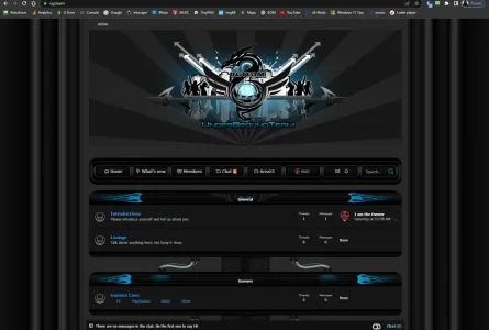
When you do away with it, your navbar then looks like this

Screen Shot 2022-10-09 at 8.22.36 PM.png

Any tweaking of the text you are also going to have to figure out how to move the image background to center it.. not only for the .p-nav but the .p-nav-inner and the .p-nav-opposite.
The logo is in it's own little "box" (.p-header) and the Nav-bar has it's own little area. I don't think you can extend the logo downward easily because your navigation area is coded to use, as I said, an image and then a solid background color (background: #272727;) to blend with the rest of the page.

Was this a custom style you had done, or is it a paid style that you found here? If a paid style, I'd recommend posting in their support discussion for help, or better yet, going to their site. If custom, the developer should still offer you some support.
 
Last edited:
Hi Tracy.
This style i designed 18 years ago with a guy called scorpion and we ran it on vBulletin 3.8.6, now i wanted to have this style running on xenforo 2.2.10 patch 1, so i re-designed all the tcats to suite xenforo, but my issue is the logo and the navbar. I wanted to look like the attachment 1 and this is how it looked in vBulletin 3.8.6.

I have made areas brighter and now it so it looks like it all matches up.

Thank you all for helping me with this issue and i am happy with the result.
 

Attachments

  • 0apart1.webp
    0apart1.webp
    58 KB · Views: 3
Last edited:
Top Bottom