Make better use of screen real estate in editor toolbar

Sim

Well-known member
There's a huge amount of wasted space in the editor toolbar that could be used to bring useful icons (bullet lists? unindent?? save draft???) to the forefront so we don't have to go digging through menus to find them.

1593003687129.webp

I would have thought a better model would be to progressively collapse icons into drop down menus as you lose screen real estate rather than hide them for the sake of a "cleaner" UI.

Let the power users on large monitors get the full editor experience by exposing more icons rather than arbitrarily increasing the number of clicks required to get stuff done.

I also think it's confusing to have multiple "other icons" menus, especially when there is no visual indicator about which one houses that missing icon you are searching for - you have to remember which one to click on. One menu for additional icons should be all that's needed - especially on a large screen.
 
Upvote 38
I would have thought a better model would be to progressively collapse icons into drop down menus as you lose screen real estate rather than hide them for the sake of a "cleaner" UI.
I agree with this for sure.

I also think it's confusing to have multiple "other icons" menus, especially when there is no visual indicator about which one houses that missing icon you are searching for - you have to remember which one to click on.
I don't mind this piece. The first "Other Options" is grouped with text styling and has similar icons. The second grouping has to do with alignment. And the third has to do with multimedia.
 
The issue here is that we have to implement thresholds for each toolbar layout. With the large layout you need to look at how much space is available at its minimum size rather than how much extra space is available when you expand it.

Froala allows us four toolbar layouts, and I've prioritised those at lower resolutions so that there are different layouts for very small mobile devices and larger mobile devices then tablets and finally desktop views, but there had to be a trade-off between having a threshold that is low enough for it to be a commonly-used view versus having loads and loads of space for lots of controls.
 
@Kier have you actually done any analytics on xenforo.com to see how many people actually post using a small screen device vs a full desktop?

As much as most sites will see the majority of their readers using mobile devices, I think you'll find that the majority of the heavy posters will do so on a desktop.

I think it is doing your users here a disservice to optimise the editor so heavily for mobile devices at the expense of the editing experience on desktop, when the vast majority of long form content which relies on that editor will be created using a desktop.

I'd urge you to rethink the editor - mobile users won't use the advanced editor functions much. Desktop users will potentially use it a lot.

I know I create a lot of long form content - even here on xenforo.com in tutorials and addon writeups - and I rely heavily on the editor. So far, I'm finding this editor a huge step backwards in usability compared to XF 2.1 - and I wasn't really a fan of that either.
 
You can of course create your own button layouts, but one of the the stated intentions of the new editor was to reduce the number of controls in order to make the editor look less like a word processor.

One thing we are considering is changing the two smallest toolbar sizes so that we only have one toolbar suitable for phone-sized devices, within which we will put very minimal controls, then we could repurpose the 'large' size to have a much higher threshold and put a bunch more controls in it, for those rare few who really do want a copy of Word splatted on their page.
 
one of the the stated intentions of the new editor was to reduce the number of controls in order to make the editor look less like a word processor.
I don't really get why this was a design goal?

We are here to create content.

Some people won't care about formatting their content, they just want to type. Others will be creating rich content like articles, tutorials, addon writeups, etc.

I don't think it's a reasonable goal to make things harder for those people who want rich controls, just to make things "prettier" for those people who don't care.

One thing we are considering is changing the two smallest toolbar sizes so that we only have one toolbar suitable for phone-sized devices, within which we will put very minimal controls, then we could repurpose the 'large' size to have a much higher threshold and put a bunch more controls in it, for those rare few who really do want a copy of Word splatted on their page.
That would be great - I think it is worth experimenting with these options to see if they can strike a better balance between the rich content creators on desktop vs the lighter-weight commenters on mobile devices.
 
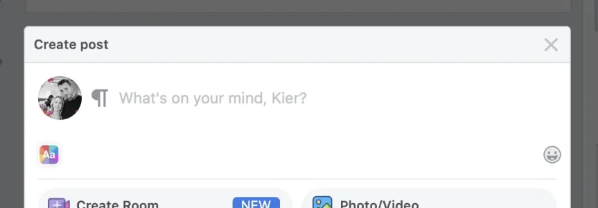
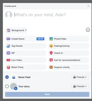
Let's look at the posting interfaces for the two platforms with more traffic than any others...

Facebook:
1593008666762.webp

Twitter:
1593008711926.webp

Additionally, I've just done a quick query and found that of the posts made today on XenForo.com, only 4.5% used BB code formatting outside of URL, QUOTE, USER, ATTACH, and B and were posted by users other than @XenForo, @Mike, @Chris D and me. That's why reducing visible controls and by extension, visual clutter, for the majority of users is a design goal.
 
Are we limiting XF posts to 128 characters now? Sorry to be a bit facetious over that but comparing to twitter and facebook is silly. You might as well completely remove the RTE if you're using those examples.
Also, the usage on XF.com shouldn't be taken as reflective of the usage in the wild on other forums. I mean, you know that though.
 
A couple of quick mockups to reduce the menus from 4 to 1. And make it easier to get a holistic overview of what options are available to a user without having to dig into each menu.

1593020066030.png

1593019627717.png

I love that you guys have added some really interesting features to make it a much more powerful content composition editor, such as having the ability to add header levels for better SEO and semantic layout. This, combined with all the other layout features of this editor make it much more powerful than the social media giants.

Keep it clean by default, but don't make it hard to find and display everything else.
The one menu button, combined with the bar that stays visible, instead of drop down menus makes this potentially a very powerful and usable editor for those on desktop that completely outclasses the social media editors your comparing it to. Plus you can hide the bar when not in use.

Your screenshot from the facebook editor doesn't show all the other UI components that can be expanded. So I don't think it looks too cluttered in comparison.

1593019934992.png
 
I did vote this, but I don't think it's a huge deal given we can customise it (I hope!).

I think it would be nice to give users the option though (but that would a different suggestion). This way we look like a user driven rather than admin or developer driven site.

They could choose bare bones or kitchen sink.
 
I think it would be nice to give users the option though (but that would a different suggestion). This way we look like a user driven rather than admin or developer driven site.
This would actually be a good compromise.

If we could have a user preference setting to choose between a "Clean editor UI" and a "full function editor UI" then that would allow users to select the editing experience they get.
 
Let's look at the posting interfaces for the two platforms with more traffic than any others...

Facebook:
View attachment 228734

Twitter:
View attachment 228735

Additionally, I've just done a quick query and found that of the posts made today on XenForo.com, only 4.5% used BB code formatting outside of URL, QUOTE, USER, ATTACH, and B and were posted by users other than @XenForo, @Mike, @Chris D and me. That's why reducing visible controls and by extension, visual clutter, for the majority of users is a design goal.

Yeah, but I'm not building Twitter or Facebook - I'm building a community with real content, much of which is long form.

You've just given us new thread types, including articles - which are intended to be long form content, but then you're trying to give us a content creation experience more akin to the short form content that is Twitter and Facebook.

Most posts on a forum are short and no different to Twitter / Facebook. However, the posts that are long are typically very long and use a LOT of formatting and this editor makes it much more difficult to create that extremely valuable long form content.

The whole USP of forum software is that we can give a much more rich experience of content creation and navigation that what you get from Facebook groups.

If you're trying to give us an experience that is similar to Facebook groups - then we've already lost the battle to Facebook.

Is there a way we can have it user selectable like @Mr Lucky suggested so we get the best of both worlds?
 
I've not been a fan of the new editor from the first time I've seen it in the HYS announcement, but I've given it an honest chance today. End of the story is that I've just given up to post any content that requires what I consider basic formatting, even if it's not widely used.

I think look should not be the driving factor behind the development of a functional tool. In fact, look should always come second to usability. You can have the prettiest car, if it doesn't drive, it's useless. And usability has heavily suffered under unintuitive dropdowns, long transitions, hard to reach items.

The old editor might not have been the prettiest tool out there, but it could've been spiced up a lot without sacrificing vital functionality. Of course the broad mass doesn't use formatting for their posts, but by that logic we wouldn't need an editor at all and could just do with a basic text editor. The point of an RTE is to make it easier to perform complicated formatting tasks, not harder.

I also think that comparing facebook and twitter posting to forum posts is very far fetched. Both are technically personal pinboards, so if you wanted to compare them, first and foremost they should be compared to profile posts, where not too long ago the decision was made that they could very heavily profit from formatting so they got BB code support added.
 
Let's look at the posting interfaces for the two platforms with more traffic than any others...

Facebook:
View attachment 228734

Twitter:
View attachment 228735

Additionally, I've just done a quick query and found that of the posts made today on XenForo.com, only 4.5% used BB code formatting outside of URL, QUOTE, USER, ATTACH, and B and were posted by users other than @XenForo, @Mike, @Chris D and me. That's why reducing visible controls and by extension, visual clutter, for the majority of users is a design goal.

I understand, but the whitespace between the controls in desktop view just doesn't feel right. In my experience, too much whitespace is also some form of visual clutter.
 
Just tried the new editor on iOS and it’s a bit of a mess.

Clicking in the reply box brings up the quick insert + pop up that hides the text you’re trying to type.

There’s a menu expand button on the far left that expands the menu to a second line but with no new buttons (is something broken there?)

Hitting return for a new line brings up the quick insert thing again so you have to hit return multiple times.

A large chunk of the menu bar is empty at this viewport size too.
 

Similar threads

  • Suggestion Suggestion
Lack of interest Make better use of cache
Replies
0
Views
816
Top Bottom