XF 2.2 Logo too small on mobile

Compi

Member
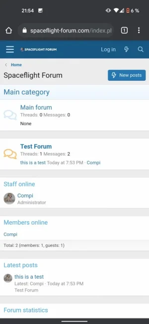
So on mobile the logo of my site looks like this:
WhatsApp Image 2021-07-28 at 21.55.11 (1).webp
It's too small.
I did some googling and found this code:

CSS:
// ########################### FULL SIZE LOGO ON MOBILE ########################
.p-nav-smallLogo {
    display: none !important;
}
.p-header-logo {
    max-width: none !important;
}
.has-js .p-header {
    display: block;
}


But that one produces this:
WhatsApp Image 2021-07-28 at 21.55.11.webp

Doesn't look good either.
What do I have to do to make it look like the first one, just with a bigger logo?


Cheers
Compi
 
I believe you don't have to add any extra CSS, just increase the pixel size of the logo. Mine is 800 x 130 and looks good. Doesn't seem to slow loading times or anything.
 

Attachments

  • IMG_4788.webp
    IMG_4788.webp
    4.9 KB · Views: 57
Did you add your code in extra.less template? The code you have should work if it's in extra template


.p-nav-smallLogo
{
display: none !important;
}
.p-header-logo
{
max-width: none !important;
}
.has-js .p-header
{
display: block;
}
 
Did you add your code in extra.less template? The code you have should work if it's in extra template


.p-nav-smallLogo
{
display: none !important;
}
.p-header-logo
{
max-width: none !important;
}
.has-js .p-header
{
display: block;
}
This is really useful - thank you! However my view on mobile now has a lot more space under the logo in the header section (but not on computer view which looks the same as before). So my logo is great - bigger and easier to read - then a lot of space under it in the colour of the header bar, before the hamburger menu, login, register lines etc etc
 
Actually I changed my logo to a different design and the second one fitted well without gaps underneath so may have been something to do with my logo design. The code works well.
 
Ok so here's what I found. If the logo is top left on computer screen, and you use the code above - it works but it leaves quite a gap under the logo - to much header space under it. Whereas if I have my logo centred on computer screen it displays perfectly on mobile screen, centred vertically in the header bar and no gaps. So I've left my logo centred on computer screen for that reason. Even though I read that logos on forums look best top left as that is where the eye is drawn. But I don't mind mine being in the middle - then it looks more like a web page (as have a home page with articles on). So a compromise I guess.

Unless there is other code that allows a top left logo to display well on mobile view without a big header bar gap under it!
 
Hope I can continue in the existing thread about the logo being too small. Can the location and size of the logo be changed?
Actually, the question might get noticed more if it was in its own thread. It is kind of buried here since it is not about the original issue. Just a thought.
 
Back
Top Bottom