Line/separation above/below pagination - what's your opinion?

dutchbb

Well-known member
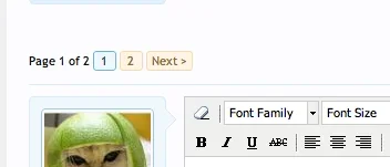
A small change was done in beta 3 on the view thread page as seen below:

This is how it was in beta 2:
line_pag_above.webp

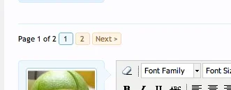
This is how it now is in beta 3:

line_pag_below.webp


Of course we all know this is just a quick template edit to adjust it to your own liking, but IMO the former layout was just better. It separated posts (content) from navigation (functionality). The new layout not only doesn't separate the last post on the page from the navigation, it also separates functionality from functionality. Also, it does feel more clutterish (is that a word?) to me than the old layout.

Opinions?
 
I like both versions. The second version,IMO, signals to me the bottom of long thread lists more clearly, as you see the pagination appear before the separator. As you pointed out it is a simple template edit, so I think it will be one of those personal taste changes people may choose to make. :)
 
I don't like the line either. Even though this is waaaaaay less cluttery (or, way more streamlined) than the previous software, there are still a lot of things I want to organize better. If I ever figure out CSS layout, anyway.
 
The underlying issue here is that I switched the posts from having a bottom border to having a top border, as it simplified the CSS significantly (.messageList no longer requires border rules) but it would be relatively straight-forward to move the border above quick reply to encompass the page navigator if enough people thought that was worthwhile.
 
I suppose for symmetry with the top of the page, the page navigation could be below the line and appear to be outside the thread content.

I have no preference either way though.
 
The underlying issue here is that I switched the posts from having a bottom border to having a top border, as it simplified the CSS significantly (.messageList no longer requires border rules) but it would be relatively straight-forward to move the border above quick reply to encompass the page navigator if enough people thought that was worthwhile.
I think like Quillz said a lot of people will not even notice (or care), but if it looks better then it looks better and it's worth doing IMHO.

What's the best way of doing this ourselves for now btw? I know css but not yet that familiar with this part of the code.
 
Top Bottom