Is the sidebar redundant? Can we keep it useful with better implementation for mobile?

Stuart Wright

Well-known member
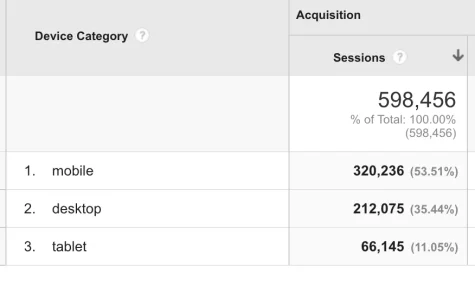
Thinking about how a huge proportion of surfing these days is on tablets and mobile phones (AVForums last 30 days = 62% desktop, 28% mobile, 10% tablet) where in most cases (except maybe tablet landscape) the sidebar is not shown, does Xenforo 2 need a better method of using the sidebar?
The sidebar is generally used for useful, but not essential information. E.g. on the Xenforo forum list. Narrow the page and by default the sidebar gets pushed below the main content where we can safely assume it will be largely unseen.
Sometimes (like on the media gallery and resources addons) the sidebar content can contain essential things like filtering and navigation elements. What a pain it is to scroll all the way down to be able to use these.

I'm pretty confident that the Xenforo guys, being as clever as they are, they are looking at incorporating the most popular addons like sidebar widget management into the core software for Xenforo 2.
I worry, however, whether mobile usage is going to get the attention it needs.
I think that developers should be working on how the UI works on mobile portrait as the primary method of using the site.

To that end does anyone else agree that the sidebar needs better implementation than in XF1?
The XF team, being clever, may have already considered this, but just in case, I think we need to raise the subject.

How about, for example, on narrow screens, the sidebar collapses into a static button to the side of the page which, when activated, slides the sidebar over the main content?
We've implemented a similar idea (a SHOW FILTERS button in the page rather than stuck to the side) on our Mobile Phone price comparison feature.
 
Last edited:
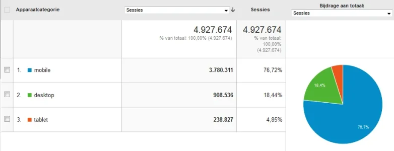
I also hope that XF2 will bring a mobile-first design which also works well for desktop. My big board has a 76% mobile and 4% tablet use.Overzicht   Google Analytics.webp

The XF1 type Responsive design was a step up from non-responsive, but it really falls short for mobile use.

I think solutions for sidebar blocks depend on its use. Your filters block is a good example. This block needs to be hidden for mobile, but accessible at the top of the page.
Other sidebar blocks need to be completely hidden or accessible from the bottom.
 
The sidebar should only ever really include stuff you can live without. Just look at facebook for an example. They have a sidebar full of stuff that just isn't shown in the mobile app.
 
The sidebar should only ever really include stuff you can live without. Just look at facebook for an example. They have a sidebar full of stuff that just isn't shown in the mobile app.

Only when it functions as it does.

I would like to see the option to have (in mobile view) important sidebar items slide above the main content and the other stuff below.

This was my point about the RM categories. That is important and so should go above.
 
The sidebar should only ever really include stuff you can live without
Yup - generally for anything <1366x768 resolution, the sidebar is useless in responsive designs. I use Google Analytics event tracking on sidebar links to see how much use they get and not much at all especially for <1366x768 resolutions desktop wise and mobiles.

Luckily, my sites have only between 2-10% mobile/tablet with rest desktop.


Yours would be expected to be low because it is more oriented towards people using a command line.

They may find your site by mobile but make a point to visit again on desktop.

AvForums probably has a low mobile because it has the app.

I'm around 71% mobile.
 
Wow. This is a critical issue for you, then.
If it doesn't work in mobile then there's no point to having it.

I find myself struggling to get information to members and guests.

The notice at the top is OK but anchor points and delayed sync of js means the user has already scrolled down and missed it.

I try to add links in obvious places to help aid navigation and common tasks.

Like:

Find all posts by user on the user card instead of view profile, postings and find new content.

Find all new within a section and it's sub forums.

Thankfully editing your user settings is painless enough in xf.
 
As XenForo 2 comes along, mobile friendly design and additional add-ons to promote that where lacking will be something we'd be looking to do. There's obvious huge expansion in mobile and it's clearly the way forward, so I'm sure other developers will also look to improve forums in that area. I'd guess that within 6-8 months of a XenForo 2 stable launch there should be a wide array of add-ons that promote mobile use and make it more friendly to use.
 
How about no sidebar? Sidebars just take up real estate.

Personally I prefer neat little boxes in the footer.
I have read quite a lot of information about the optimal number of words of text on a line for easiest reading. Basically if there are too many words on each line, the text becomes harder to read because the eyes find it more difficult to return to the start of the next line.
With Xenforo's default text size, there is real estate enough for a sidebar on windows wider than about 960 pixels.
A 300 pixel wide sidebar is also useful for placing MPU adverts which can be a significant proportion of a website's revenue.
At AVForums we place an MPU at the top if the sidebar and when there is room, one mid way down and one at the bottom.
So a sidebar can be extremely useful, but we also have to cater for when there is no room for it.
 
Desktop screens today are like the progressive enhancement design technique of catering towards sophisticated browsers in the past.

Web devs used to design a site to work well in all browsers, even if it didn't look pretty, then tart it up to look great in modern browsers using progressive enhancement.

Now even mobile browsers are incredibly powerful. We really need to design for mobile first, and the desktop experience should be progressively enhanced as the screen size gets larger.

I do like the slide in menus from the side that take up the whole screen, or most of it. Makes great use of the space, easier to communicate more info, larger tap targets.

Using slide in menus you can potentially have a lot of extra functionality at any given point on a mobile screen, two menus, one that can slide in from either direction, and modals which can range from small pop ups to full screen.
 
Top Bottom