Indignant Artist - SleekVb XenForo Style Review

GCSkye

Active member
Forum topics.webp canyoujustbemine.webp
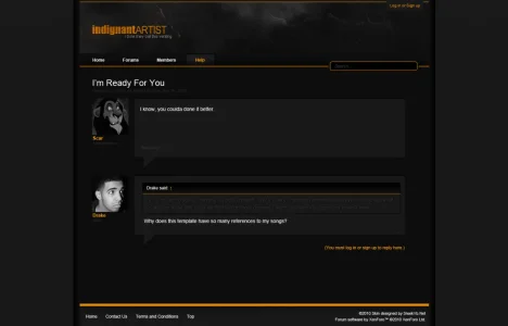
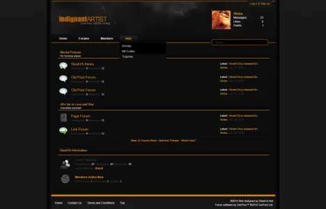
1. Post Preview | 2. Homepage Preview

For the most part this template templates design is complete. The images above are the PSD preview images, the template has not entered coding just yet.

The plan is to release the template with and without the sidebar, both fixed (1000px) and fluid available. Only the fixed version will include the no sidebar option.

The preview of the homepage included in the PSD screenshots above is of the no sidebar template.

Feedback appreciated, hoping to get a few XenForo user changes in before release :)

Full Size Screenshots
http://sleekvb.net/img/firstlook/indignantartist-home.png
http://sleekvb.net/img/firstlook/indignantartist-post.png
 
Quotes are practically unreadable.

Just out of curiosity, does your computer/laptop have a matte monitor or a glossy monitor? Because after I switched to a glossy monitor, I couldn't stand black styles anymore, even my own. The blacks are too black and if the text is a subtle color it just blends into the background.

Although I suspect that clear fonts (? the antialias thingy) has something to do with that text issue - it's a bad combination, subtle plus fuzzy text.
 
Quote text is easily fixed with CSS edits. The quote box itself could also be made with CSS 3, but it's a pain in the butt to do double the work to support non-CSS 3 supporting browsers.

Personally I like the style. I'd like to see a little more yellow used subtly here and there.
 
Looks very nice. I agree with the comments about the quotes, the text needs to be a bit brighter, at least on my screen.
 
Just out of curiosity, does your computer/laptop have a matte monitor or a glossy monitor? Because after I switched to a glossy monitor, I couldn't stand black styles anymore, even my own. The blacks are too black and if the text is a subtle color it just blends into the background.

Although I suspect that clear fonts (? the antialias thingy) has something to do with that text issue - it's a bad combination, subtle plus fuzzy text.
My computer has a matte screen. On the right angle, it's more readable, however moving even slightly off centre makes it difficult.

My suggestion would be to just bring the contrast between the quote text and the background up a little bit by lightening the text. Hope that's helpful.

Apart from that, it looks good. Nice work.
 
Quotes are practically unreadable.

Hey Coby,

Thanks for the feedback. I'll see what I can do. :)

Quote text is easily fixed with CSS edits. The quote box itself could also be made with CSS 3, but it's a pain in the butt to do double the work to support non-CSS 3 supporting browsers.

Personally I like the style. I'd like to see a little more yellow used subtly here and there.

Hey OSS 117,

Any good tips for where you would like to see the yellow? Originally on the homepage I had the grey dividing forum lines the same yellow as everything else. I felt that made everything look a little off so I changed them to the grey. I would be happy to take suggestions.

Yellow quote font? ><

Just out of curiosity, does your computer/laptop have a matte monitor or a glossy monitor? Because after I switched to a glossy monitor, I couldn't stand black styles anymore, even my own. The blacks are too black and if the text is a subtle color it just blends into the background.

Although I suspect that clear fonts (? the antialias thingy) has something to do with that text issue - it's a bad combination, subtle plus fuzzy text.

Hey Anotheralias,

Glad you stated this. A lot of people don't realize how much the type of monitor you have can effect the way images appear on monitors. Thou in this case, they grey on grey is a little much :)
 
....how much the type of monitor you have can effect the way images appear on monitors.

I didn't realize it myself until I got the glossy monitor - which I hate to pieces. For that reason I can't even comment on a black style, because I know I'm seeing a skewed version of it.
 
Before I answer, is that even yellow? I thought I saw yellow last night, but it looks orange to me now. I must have thought it was yellow.
 
Pick a darker burnt yellow for the horizontal line that lines up with the search field and give a 1 px horizontal line on top of each button in the main menu to accent it. Not too bright, something a little dim.
 
Top Bottom