Fixed  Inconsistent navigation -- "Help" and "Your Account" pages

Enigma

Well-known member
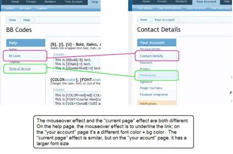
The navigation menu on the "Help" page and "Your Account" page look the same, but are slightly inconsistent. For consistency, why not use the same mouseover effect and the larger font size for the currently selected menu item on the "Help" page as you do on the "Your Account" page. Kthxbai.
 
I don't get it? They're the same here. Can you perhaps example this with a screenshot?
 
Ah! I see, sorry, I thought you were talking about Account in the top navbar, not the "account's page - side bar".
Thanks for the screenshot, appreciated. I like the new CSS. The devs are doing an amazing job.
 
Top Bottom