For your consideration please...
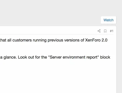
In forum thread view: A very small bookmark icon with no text > Location: Top corner > right aligned
Suggestion: Please add the text: "Add Bookmark" alongwith the icon for more visibility and consistency with implementation at MG & RM.
Bug report?: It is taking me 4-5 clicks to register a tap on this icon on my mobile device (Android Oreo, Note 9). Apparently, the bookmark icon itself is so small that it misses my taps altogether. Adding a "Add Bookmark" text may help resolve this issue. At the same time, the share icon, on the left-side of it, is pretty consistent in registering my taps.
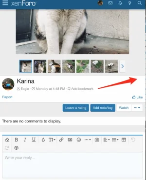
In Media Gallery: Bookmarks icon with "Add Bookmark" (Text) > Location: Top corner but Left Aligned?
Suggestion: Bookmark link location should be right aligned for the sake of consistency.
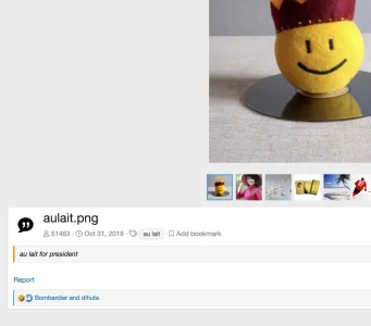
In Resources: Bookmarks icon with Add Bookmark (Text) > Location: Bottom corner > right aligned?
Suggestion: For more visibility and consistency, the link should be at the top corner > right aligned just like in threads...
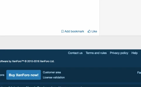
In conclusion, the [Bookmark icon + Text] should be either at top right corner at all locations.
Thank you
In forum thread view: A very small bookmark icon with no text > Location: Top corner > right aligned
Suggestion: Please add the text: "Add Bookmark" alongwith the icon for more visibility and consistency with implementation at MG & RM.
Bug report?: It is taking me 4-5 clicks to register a tap on this icon on my mobile device (Android Oreo, Note 9). Apparently, the bookmark icon itself is so small that it misses my taps altogether. Adding a "Add Bookmark" text may help resolve this issue. At the same time, the share icon, on the left-side of it, is pretty consistent in registering my taps.

In Media Gallery: Bookmarks icon with "Add Bookmark" (Text) > Location: Top corner but Left Aligned?
Suggestion: Bookmark link location should be right aligned for the sake of consistency.

In Resources: Bookmarks icon with Add Bookmark (Text) > Location: Bottom corner > right aligned?
Suggestion: For more visibility and consistency, the link should be at the top corner > right aligned just like in threads...

In conclusion, the [Bookmark icon + Text] should be either at top right corner at all locations.
Thank you
Upvote
1
