Adam Howard
Well-known member
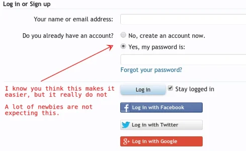
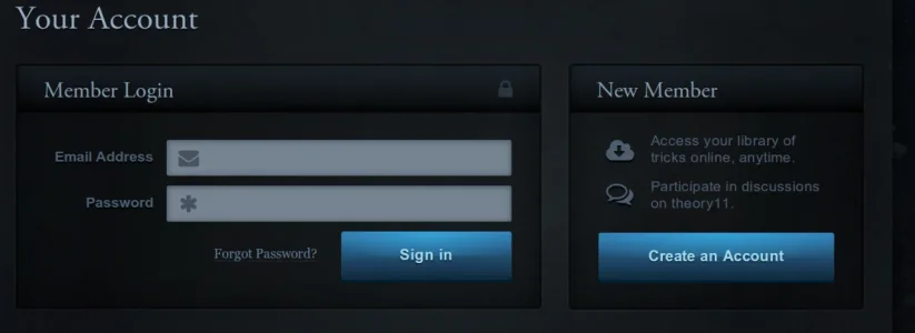
First I believe we should have two tabs at on top. One for sign in and one for registration. Because as much as you would think the small checkbox for selecting sign in or registration would be intuitive, it's often not for newbie. Even large social networks do not follow this principle and so the younger generation do not expect it either.
current

proposed new version (ignore the the theme)

current

proposed new version (ignore the the theme)

Upvote
10
