XF 1.5 Images blow out on Mobile and Computer.

So we have images set to 960x960 and enable responsive design, but when on a phone if you click the picture gets huge and goes from mobile size forum to desktop size forum and breaks it all. It also does this on desktop view also.

Any ideas why?

Thanks
 
Last edited:
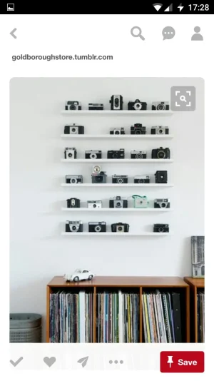
Tapping on the image above allows for inspection on a mobile.

Sure it sort of breaks the template until the user is finished inspecting the image.

If the image above was clearer you would be able to read off the brand names...
 
Does this produce a light box?
 

Attachments

  • image-0-02-04-0aab291e192033a005f1cb503687f12412bf35f9a87bebd70bb5d4a1592eb1ec-V.webp
    image-0-02-04-0aab291e192033a005f1cb503687f12412bf35f9a87bebd70bb5d4a1592eb1ec-V.webp
    48.6 KB · Views: 2
  • Rambo ikea.webp
    Rambo ikea.webp
    22.1 KB · Views: 2
If I tap on the image in attached rather than the link I get a lightbox.

Anyhow I'm sure there has to be a CSS fix to stop the image expanding.

I'll have a look when I'm on desktop. On mobile at the moment.
 
Back
Top Bottom