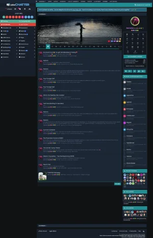
One month out from our 5th Birthday, we've updated to Idle Chatter v5
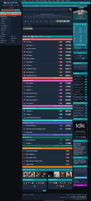
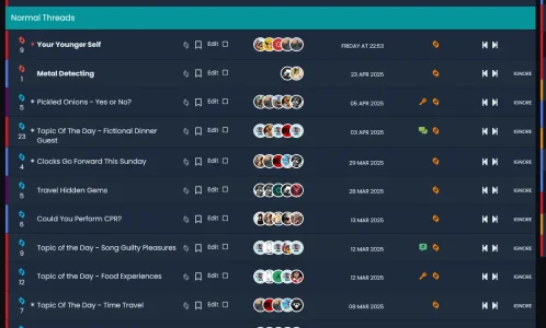
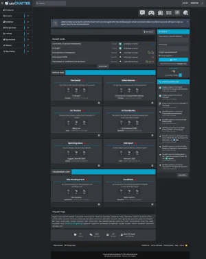
We've reworked the forums index categories and layout, tweaked some colours, and whatnot. And for a bit of fun we've looked back at our first few days in existence compared with now


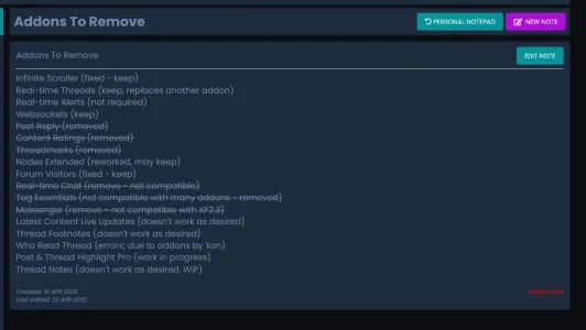
I've removed a whole lot of addons from the site since the last update, we no longer use Threadmarkers, Content Ratings, Tag Essentials, or [tl] Post Reply - I became disillusioned and fed up with the amount of errors these addons were causing, so they've gone.
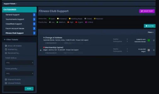
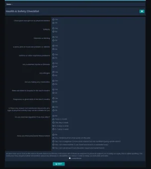
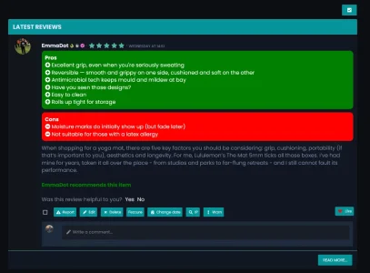
I've made a few layout adjustments too...

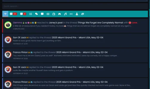
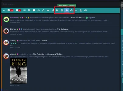
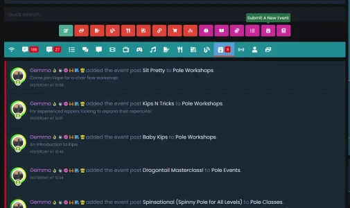
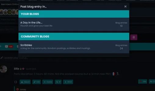
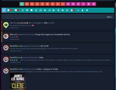
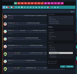
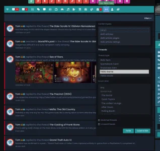
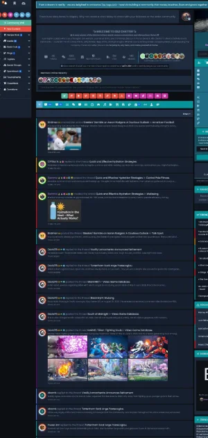
After helping someone with their What's New/Latest Activity layout, I decided I liked the idea and implemented something similar into my own site - I also added some other little tweaks

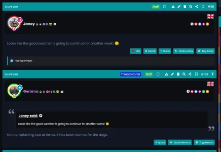
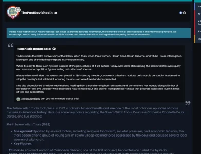
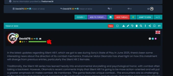
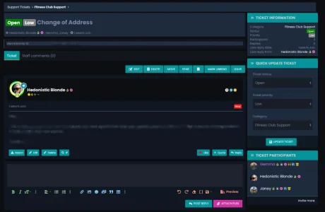
I've updated parts of the thread view/post layout - adding new online/offline indications, revamping the quotes bbcode, and fixing small issues with the post action buttons (not sure if that's what you call them - edit, report, delete etc)

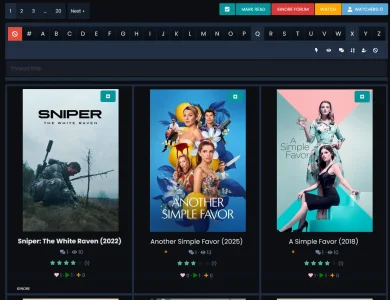
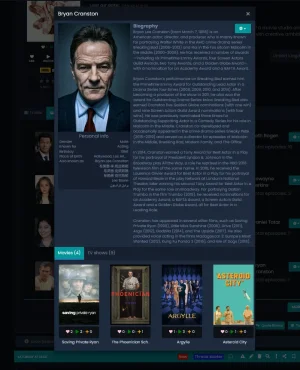
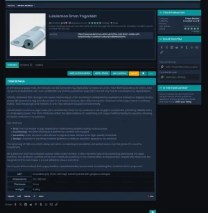
I've "improved" the Movie, TV, Game, and Music Thread Starter addons thread view layout and also tweaked the movie/tv show cast, recommended, and similar layouts


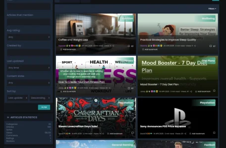
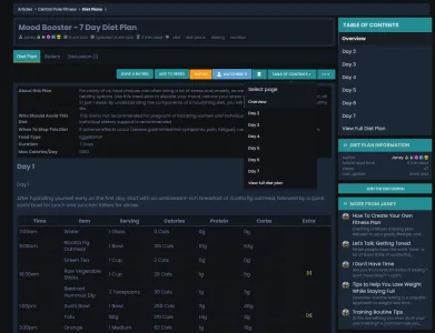
There have been some improvements made to the Article System (
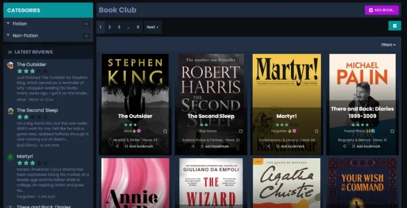
@Bob Article Management System), Book Club (
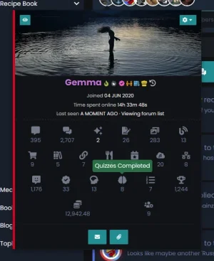
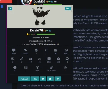
@Bob Item Management System), the member tooltip, and member profiles layout


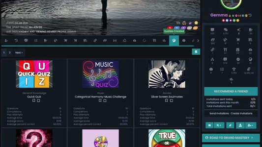
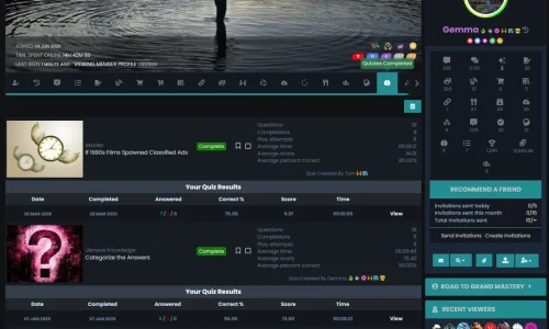
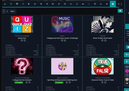
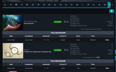
Two new sections have been added to member profiles for the Quiz addon - quizzes created and quizzes completed


Our "quick topics" section has an updated layout

Some of our AI Bots are now using OpenRouter models

We've added a member notepad to the account area so members can leave notes for future reference

There are tons of our small improvements that I've probably forgotten about but, as always, thanks for looking


