ActorMike
Well-known member
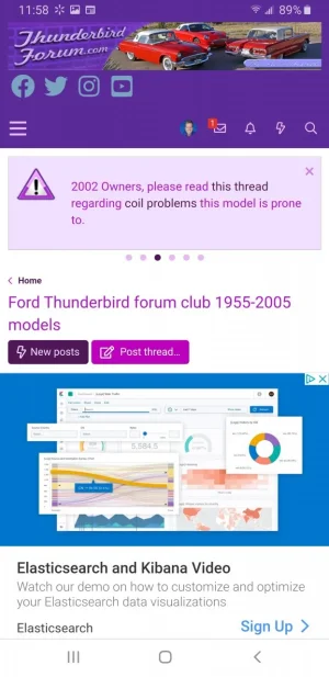
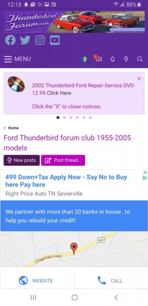
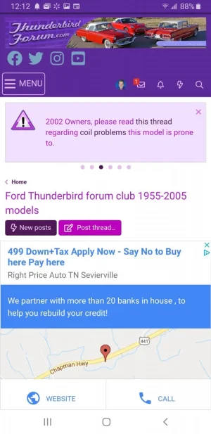
I'm always asking questions, so I thought I would make a contribution. AB testing has shown adding the word MENU next to your Hamburger icon makes a significant improvement in user engagement. Adding a border or background color improves even further. I strongly suggest adding the word MENU at the least for all the newbs visiting the website.
You will probably have to make adjustments for your theme such as the border color and alignment. Feel free to share any improvements on this or mistakes you see.
Add this to your Extra.less to add the menu
Add this to your Extra.less to add the menu to add the border.


You will probably have to make adjustments for your theme such as the border color and alignment. Feel free to share any improvements on this or mistakes you see.
Add this to your Extra.less to add the menu
CSS:
a.p-nav-menuTrigger::after {
    content: "menu";
    font-style: normal;
    text-transform: uppercase;
    font-size: 1.3em;
    padding-left: 3px;
    position: relative;
    top: -4px;
}
Add this to your Extra.less to add the menu to add the border.
CSS:
.p-nav .p-nav-menuTrigger {
    display: none;
    vertical-align: middle;
    align-self: center;
    margin-left: 4px;
    margin-bottom: 4px;
    margin-right: 5px;
    padding: 4px 4px;
    border: 1px solid #f0bafb;
    border-radius: 5px;
}