You are using an out of date browser. It may not display this or other websites correctly.
You should upgrade or use an alternative browser.
You should upgrade or use an alternative browser.
How do I make my BG look the same on all resolutions?
- Thread starter JABRONI
- Start date
F
Floris
Guest
You could set the page bg img to be a negative to the left, and a positive from the top (no-repeat)
And then the whole content the normal one, to the right, top, repeat-y.
So, split the image.
And set a default bg color for both sections. You will also have a page that loads 65% faster.
And then the whole content the normal one, to the right, top, repeat-y.
So, split the image.
And set a default bg color for both sections. You will also have a page that loads 65% faster.
Your forums width is being determined by a fixed width, so screen size does not affect the width of the content, all I can think is you are not telling the background image to align "top center".
If you apply the background image in the style properties in General/HTML you will see a data entry box to the right of the background field entitled 'position', put top center in there, this will give the background image a fixed position where it will stay at the top of the screen in the centre no matter what image resolution is used by the end user.
If you apply the background image in the style properties in General/HTML you will see a data entry box to the right of the background field entitled 'position', put top center in there, this will give the background image a fixed position where it will stay at the top of the screen in the centre no matter what image resolution is used by the end user.
Could you work it like a sprite sheet? Same image but only left half showing to the left of main content area and only the right half showing to the right of the main content area
that's a great idea. How to do this?
that's a great idea. How to do this?
I dont know but if you find out then let me know.
If it's one big image then you can center it to ensure it is positioned uniformly around the content:
Admin CP -> Appearance -> Style Properties -> General -> Body

You can also set a fixed width for the Body so it doesn't change with the size of the browser window. See this thread:
http://xenforo.com/community/threads/wallpaper-size.22055/
Admin CP -> Appearance -> Style Properties -> General -> Body

You can also set a fixed width for the Body so it doesn't change with the size of the browser window. See this thread:
http://xenforo.com/community/threads/wallpaper-size.22055/
Or here is code for using multiple background images:
Admin CP -> Appearance -> Style Properties -> General -> Body
> Miscellaneous
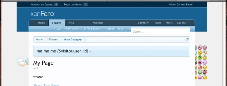
I am using some default images to demonstrate. This is the result:

But the images are still subject to the width of the Body (which can change with the size of the browser window). Again, using a fixed body width fixes this. I am using a fixed body width in the above image.
Admin CP -> Appearance -> Style Properties -> General -> Body
> Miscellaneous
Rich (BB code):
background: url('styles/default/xenforo/node-sprite.png') left center no-repeat, url('styles/default/xenforo/xenforo-smilies-sprite.png') right center no-repeat;I am using some default images to demonstrate. This is the result:

But the images are still subject to the width of the Body (which can change with the size of the browser window). Again, using a fixed body width fixes this. I am using a fixed body width in the above image.
Jake,
- my fixed width style has a width of 990px. What size would the left-image or the right-image have to be to make this properly?
- what happens when somebody browses the website on his mobile phone. Will the image harm the view?
Many thanks!
- my fixed width style has a width of 990px. What size would the left-image or the right-image have to be to make this properly?
- what happens when somebody browses the website on his mobile phone. Will the image harm the view?
Many thanks!
- my fixed width style has a width of 990px. What size would the left-image or the right-image have to be to make this properly?
Make sure it's a fixed body width and not just a fixed content width. Without a fixed body width you cannot depend on the width of the body being the same for the purpose of precisely fitting a background image around the content, unless it's one big image and you center it.
- what happens when somebody browses the website on his mobile phone. Will the image harm the view?
Nope.
I have a similar issue where the background image is cut off on pages that don't have enough content.
What it should look like:
http://dl.dropbox.com/u/414134/wpplatoon/xf_bg_issue_2.png
What actually happens:
http://dl.dropbox.com/u/414134/wpplatoon/xf_bg_issue_1.png
(note the empty grey area at the bottom, as well as the background image being cut off)
Anyone have any ideas on how to fix this?
(without a hacky workaround - e.g. adding <br/> to the page node)
I have a similar issue where the background image is cut off on pages that don't have enough content.
What it should look like:
http://dl.dropbox.com/u/414134/wpplatoon/xf_bg_issue_2.png
What actually happens:
http://dl.dropbox.com/u/414134/wpplatoon/xf_bg_issue_1.png
(note the empty grey area at the bottom, as well as the background image being cut off)
Anyone have any ideas on how to fix this?
(without a hacky workaround - e.g. adding <br/> to the page node)
Here is something you can try:
Admin CP -> Appearance -> Style Properties -> General -> Body
> Miscellaneous
Add this property:
Code:
background-attachment: fixed;That will cause the background image to remain fixed while the rest of the page scrolls normally.
For reference:
http://www.w3schools.com/cssref/pr_background-attachment.asp
Here is something you can try:
Admin CP -> Appearance -> Style Properties -> General -> Body
> Miscellaneous
Thanks. I tried adding that property but it didn't fix the issue. It still cuts out at the same place as before.
Any other ideas? Might try looking at that link..
Have you tried the CSS property background-size?
Unless I'm misunderstanding your needs, that should make the width fit their resolution, and the height match proportionally. If you're more concerned about the height matching, you can switch 100% and auto. That should get it to be pretty close, though it seems your layout is fixed width. Try sending page width in % rather than px. Also, unless you serve up different images for different resolutions (easily accomplished with JavaScript for detecting the resolution, and then serving up different images with their JavaScript or PHP), you'll likely always have differences between different aspect ratios.
Code:
background-size:100% auto;Unless I'm misunderstanding your needs, that should make the width fit their resolution, and the height match proportionally. If you're more concerned about the height matching, you can switch 100% and auto. That should get it to be pretty close, though it seems your layout is fixed width. Try sending page width in % rather than px. Also, unless you serve up different images for different resolutions (easily accomplished with JavaScript for detecting the resolution, and then serving up different images with their JavaScript or PHP), you'll likely always have differences between different aspect ratios.
Thanks. I tried adding that property but it didn't fix the issue. It still cuts out at the same place as before.
Any other ideas? Might try looking at that link..
Try shrinking the image to fit better within the browser window.
Have you tried the CSS property background-size?
Code:background-size:100% auto;
Unless I'm misunderstanding your needs, that should make the width fit their resolution, and the height match proportionally. If you're more concerned about the height matching, you can switch 100% and auto. That should get it to be pretty close, though it seems your layout is fixed width. Try sending page width in % rather than px. Also, unless you serve up different images for different resolutions (easily accomplished with JavaScript for detecting the resolution, and then serving up different images with their JavaScript or PHP), you'll likely always have differences between different aspect ratios.
Tried a few things based off that but it didn't help. I'm pretty sure the issue is due to the style cutting the page short, but I'm not sure were to look..
Tried a few things based off that but it didn't help. I'm pretty sure the issue is due to the style cutting the page short, but I'm not sure were to look..
The page is only as tall as the content which varies. But if you use background-attachment: fixed; then you can at least fit the background to the height of the browser window which is more consistent.
Here is an example of a forum that uses a "fixed" background image:
http://www.nextgengamers.org/community/
You will notice the image stays fixed as you scroll.
I already tried using that and as I said before, it didn't fix the issue. While it makes the background fixed on the main page, on the other page (with little content), the background doesn't fit to the height of the browser window.
I also tried fiddling around with the body{} wrapper. Added "height: 10px" which altered only the background height, but setting it to 100% had no effect. Does that help in any way?
Similar threads
- Locked
- Question
- Replies
- 1
- Views
- 510
- Question
- Replies
- 1
- Views
- 378
- Replies
- 9
- Views
- 1K
- Suggestion
Lack of interest
Adjust spacing below h1 main page to look the same on all browsers
- Replies
- 0
- Views
- 504
- Replies
- 3
- Views
- 1K

