HerBlackBox

madshark

Member
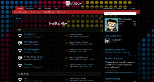
Just thought I'd share what we've been up to with XenForo now that we've got most things sorted..

www.herblackbox.com
Not all who wander are lost

The theme is courtesy InsomniaInc and was whipped to gether in a very short time. Absolutely in love with the styling capabilities.

"This is how a style editor should be not make me tear out my hair while looking up style vars. Leaving me that much more time to do what I'm supposed to be doing, Styling."

They'd be happy to whip something up for anyone who is interested can leave a message on their Facebook Page or shout my way if anyone is interested.

Also sign ups are currently open and what we have is a pretty open minded alternate community so if anyone is interested please do sign up we'd be glad to have you on board.

A huge thank you out to the DevTeam at XenForo the software is amazing and increased my activity at least 200% We only went live in March and since we switched over to XenForo we've one from 200 Posts to nearly 800 in less than a month. Running a forum in this manner is a breeze.
 

Attachments

  • s1.webp
    s1.webp
    25.6 KB · Views: 15
  • s2.webp
    s2.webp
    43.9 KB · Views: 12
Not much for dark themes, but I like what you did with the style, reverse message thing :D 
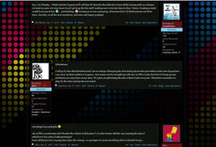
Glassy look makes the theme look sexy. There is one notice though which is impossible to read:

4540540932.png


Too much notices are hopefully for start there and never be seen. One I get, two bearable but more than that not.
 
Oops. Missed that one. I just installed the Notices Mod. I agree with the over slamming of Notices but things work in such a weird way there that new members have a tendency of messaging me and going why can't I do this that and that. Hence the notices. No notices for the regular members at all. I must opt for a better solution tho.

I wasn't planning on going glass. But then CSS3 coupled with XenForo styling makes things so easy and you never know where you end up. I'm with you a 100% on the dark themes. But I got an earful from the rest of the guys about the forum concept and yadi ya figured this was the best option.

Thank you so much for the input!
 
Hi, looks good with the glass. Maybe tone down the background just a little, opacity wise as it distracts from the content. Also, the background doesn't look good on my resolution (iMac 27") as it repeats and looks odd. Maybe try a different, yet still funky background that repeats nicer?
 
One suggestion I have is on the home page, to have that big logo as a link to the forum.
It took me a while to see the small "forum" navbar link.

I don't really care for dark styles but you've done a nice job with it.
The forum seems to load very slow for me..
Clicking a thread from the /forum/ page takes 30 seconds to load according to firefox, these may be the longer threads?
Refreshing on the forum page also takes 4 or 5 seconds.
I see a little stat thing in the footer that always says the site loads in .08 seconds, so I'm not sure what it's reading?

Good luck with the site, but I'd suggest looking at the load issues before anything else. :)
 
I will add a link on the front page. I didn't think of that. Thanks.

Yeah its just started today Im noticing it as well. Usually it takes a few seconds at max. Must give a shout to Shamil. I did install the quotes mod but I doubt its that :/
 
Gents, when you get a chance, can you check my site? - I'll edit my post afterwards as to not thread hijack, but I cant for the life of me see how I can get rid of that gap between the logon bar and the top of the header - any ideas?

http://www.psvaddicts.com

Check the paddings and margins for loginbar and the header? Im just running out and my internets clearly messed up only parts of your forum are loading. If someone hasn't given you more insightful info when I get back I'll look into it a little deeper and give you a hand. But Im sure its the paddings. Just check the css files for loginbar and the header there should be a 20px odd margin bottom or top.
 
Hi, looks good with the glass. Maybe tone down the background just a little, opacity wise as it distracts from the content. Also, the background doesn't look good on my resolution (iMac 27") as it repeats and looks odd. Maybe try a different, yet still funky background that repeats nicer?

This is looking good but I agree with adjusting the opacity a bit. Its just a little too transparent.
Well done
 
I LIKE the background on this. Don't change it. I have a widescreen monitor (23") and this background is fine, no repeating at all. .
 
yes much MUCH better on the load time :)

I'd still make that image on your homepage the link to the forum, but at least you have a link under it now :)
 
Yes I meant to do that after you told me >< clearly Ive been completely out of sorts. It shall be done. Thanks much Brandon

p.s altho I remember now why I didn't originally. I didnt want people going into the forum straightaway because of the invite only ploy. RIght now sign ups are open because I need to install ragteks invite mod. Hmm must give it a second think once I install.
 
Top Bottom