How does one change the size of the header background ?
 add the code here ? any idea what the code should be ? add the code here ? any idea what the code should be ?add the code here ? any idea what the code should be ?


Try adjusting theI am trying to adjust the size of the Image - so one see's more of the cartoon characters
min-height: 240px;max-width to get it to fit better when flowed to different screen sizes.
I did what you said- and every thing went out of place and and every thing was bigger - I went Oooops ! better not do this.This in your extra.less file:
Code:p-header-logo.p-header-logo--image img { max-width: 80%; padding-left: 80px; min-height: 200px; }
Will give you this:
View attachment 289244
There may be differences in different browsers - this is in Chrome.
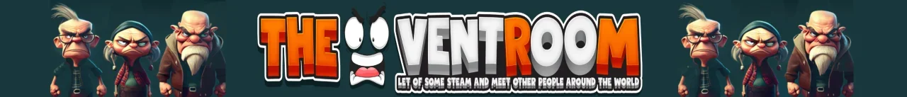
That is a good Idea- I will give this a try.You would need to experiment with the numbers - it worked fine in Chrome, for me but there can be a number of variables at play and I was just messing with the code in the browser console. Sometimes other code can get in the way so you could try adding !important to the code lines. However, the easiest way out without messing with the code would be to incorporate the cartoon characters into the logo, this is something that is very easy to do.
Thank you - but that is not the logo I am seeing - I took the angry face awayI've attached your logo in one instance, if you make your logo container the same background color as your logo background it will fit right in.

That's what's currently showing lolThank you - but that is not the logo I am seeing - I took the angry face away
 .
. 

#header
{
    overflow: hidden;
    position: relative;
    .p-header-logo.p-header-logo--image
    {
        position: relative;
        &:before, &:after
        {
            content: "";
            position: absolute;
            background: url(https://i.imgur.com/i3OLZL2.png);
            width: 320px;
            height: 200px;
            background-size: cover;
            top: -19px;
        }
        &:before
        {
            left: -120px;

        }
        &:after
        {
            right: -113px;
        }
    }
    @media (max-width: 1400px)
    {
        .p-header-inner
        {
            max-width: 100%;
 .p-header-logo.p-header-logo--image
{
position: static;
}
            .p-header-logo.p-header-logo--image:before
            {
                display: none;
            }
            .p-header-logo.p-header-logo--image:after
            {
                right: 0;
            }
        }
    }
}

Wow ! that is a lot to take in - but thank you so much for taking the time and trying to help me - I will have a look at this way and see if I can figure it outThis might be over-complicating it, but it might yield the best results for what you're after.
Bit of work to get there
1st step.) You need to trim this extra space off the logo. This will make it so on mobile the logo will have as much room as possible with no wasted space.
View attachment 289251
2nd step.) I'd save the characters as a trimmed out image too. Since they just repeat, use a single image like so:
View attachment 289252
If you can save this without the background color, that'd be great because then you could adjust the background color easily.
3rd step.) This CSS will need some tweaks after you do your logo but it will make it so the characters appear on both left/right side of the logo on all displays and will be easier to tweak for smaller displays.
Code:#header { overflow: hidden; position: relative; .p-header-logo.p-header-logo--image { position: relative; &:before, &:after { content: ""; position: absolute; background: url(https://i.imgur.com/i3OLZL2.png); width: 320px; height: 200px; background-size: cover; top: -19px; } &:before { left: -120px; } &:after { right: -113px; } } @media (max-width: 1400px) { .p-header-inner { max-width: 100%; .p-header-logo.p-header-logo--image { position: static; } .p-header-logo.p-header-logo--image:before { display: none; } .p-header-logo.p-header-logo--image:after { right: 0; } } } }
This approach makes it so on large displays, you get 2 sets of characters just outside the logo:
View attachment 289253
Smaller screens such as laptops:
View attachment 289254
And then smaller devices the left characters will disappear, the right characters will go to the right.
Again, this could be overkill but it will give you way more control, especially on smaller screens.
We use essential cookies to make this site work, and optional cookies to enhance your experience.
