RobinHood
Well-known member
As per this thread: https://xf2demo.xenforo.com/threads...ive-on-page-load-for-all-comment-threads.612/
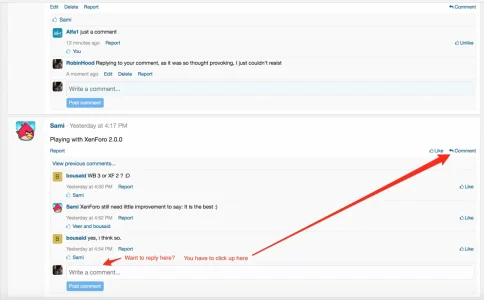
On profile comment threads, the reply box should appear on load for all profile post threads.
Otherwise you read to the end of a thread, then have to scan all the way up to the top right to click comment to reply. Really unintuitive.
Please show the comment reply box permanently for every thread.

This UI is proving to be quite confusing and unintuitive for many users, there's a few examples in the thread I linked above.
I'd like the white 'Write a comment' text box always visible wherever it's possible for a user to compose a reply, and perhaps only have the blue submit (Post comment) button appear upon focus.
This would better encourage users to click exactly where they want to reply when they see the text box, instead of having it hidden away only to be activated by first clicking a button that's sometimes quite far from where the reply will appear.
Let's not hide these things away, which may discourage some users from engaging. Sure it won't make the feed as compact or as pretty, but it will hopefully encourage more members to actually write replies in the right places and use the feature without getting frustrated. There's no point having a pretty site if it's got no activity or some users find it hard to figure out how to use properly.
On profile comment threads, the reply box should appear on load for all profile post threads.
Otherwise you read to the end of a thread, then have to scan all the way up to the top right to click comment to reply. Really unintuitive.
Please show the comment reply box permanently for every thread.

This UI is proving to be quite confusing and unintuitive for many users, there's a few examples in the thread I linked above.
I'd like the white 'Write a comment' text box always visible wherever it's possible for a user to compose a reply, and perhaps only have the blue submit (Post comment) button appear upon focus.
This would better encourage users to click exactly where they want to reply when they see the text box, instead of having it hidden away only to be activated by first clicking a button that's sometimes quite far from where the reply will appear.
Let's not hide these things away, which may discourage some users from engaging. Sure it won't make the feed as compact or as pretty, but it will hopefully encourage more members to actually write replies in the right places and use the feature without getting frustrated. There's no point having a pretty site if it's got no activity or some users find it hard to figure out how to use properly.
Upvote
3
