Lack of interest Have a character countdown on all character limited reply boxes

This suggestion has been closed automatically because it did not receive enough votes over an extended period of time. If you wish to see this, please search for an open suggestion and, if you don't find any, post a new one.

RobinHood

Well-known member
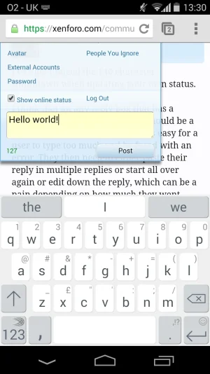
I've only noticed the 140 character countdown when updating your own status.

I think that on any reply box that has a max/min character count, there should be a countdown/counter. Otherwise it's easy for a user to type too much and be faced with an error. They then need to either paste their reply in multiple replies or start all over again or edit down the reply, which can be a pain depending on how much they went over.

It would be nice to have it when posting on someone elses profile, when responding to a status update or profile post and also when leaving reviews.
 
Upvote 4
This suggestion has been closed. Votes are no longer accepted.
So?it uses the same feature.
That's like saying XenForo should integrate instant messaging, 140 character MAXIMUM limits, hashtags, trending topics, a contacts system, etc, simply because both IM software and XenForo is a way for users to interact, no.

XenForo is forum software. It has a purpose. IM software, Twitter, Facebook, they all have different purposes. Twitter and Facebook differ heavily as well. If you want features that aren't really forum features, then they should be addons, not core. Core should only be things the majority of users will use, or rather a high number, or things that are essential to be options, something to stand out, etc. Not just every feature you can think of, that's just called bloat. In my opinion this is more of something for a plugin to handle, and where would this fit in XenForo's message box design anyway? Put it anywhere and it'd look out of place, perhaps it's own container but that just seems way too unnecessary.

Just curious if you think the counter in the user dropdown where you can update your status is "bloat"?

I find it quite handy and like the idea of having a counter there instead of typing a message out then getting a message saying it's to long.
 
That's like saying XenForo should integrate instant messaging, 140 character MAXIMUM limits, hashtags, trending topics, a contacts system, etc, simply because both IM software and XenForo is a way for users to interact, no.

XenForo is forum software. It has a purpose. IM software, Twitter, Facebook, they all have different purposes. Twitter and Facebook differ heavily as well. If you want features that aren't really forum features, then they should be addons, not core. Core should only be things the majority of users will use, or rather a high number, or things that are essential to be options, something to stand out, etc. Not just every feature you can think of, that's just called bloat. In my opinion this is more of something for a plugin to handle, and where would this fit in XenForo's message box design anyway? Put it anywhere and it'd look out of place, perhaps it's own container but that just seems way too unnecessary.
It seems i read this suggestion wrong... Apologies from me.
 
Just curious if you think the counter in the user dropdown where you can update your status is "bloat"?

I find it quite handy and like the idea of having a counter there instead of typing a message out then getting a message saying it's to long.
It uses space wisely and fits into the design because there is also a button next to it which is needed to update your status, so no it isn't bloat. If there was no Update button or it was positioned next to the text box then yes, it would be bloat. That's a much smaller area though, and easier to work with. This is a text box, and making this character count thing work on both the responsive version and normal version, without looking out of place is harder than that. If things are removed to make space for that then it's definitely bloat.
 
It uses space wisely and fits into the design because there is also a button next to it which is needed to update your status, so no it isn't bloat. If there was no Update button or it was positioned next to the text box then yes, it would be bloat. That's a much smaller area though, and easier to work with. This is a text box, and making this character count thing work on both the responsive version and normal version, without looking out of place is harder than that. If things are removed to make space for that then it's definitely bloat.

So... bloat? :D

https://xenforo.com/community/account/personal-details

Screenshot_3.webp
 
Back
Top Bottom