XF 1.5 Grid System

ChrisTERiS

Well-known member
Hello,

Can someone help me giving me a sample syntax used by xenForo Grid system?
eg Let's say that I want to display 3 blocks in a row for desktop view but 1 block per row in mobile view.

Thank you
Chris
 
There is no grid system in XenForo. You'll need to add custom css to handle those blocks.
There actually is a rudimentary column system that has been there since the beta's, but it wasn't responsive, but isn't too hard to add the code yourself to make it so.

I can't remember the code off hand, but I think it's a template called _columns.css or something similar.
 
@Forsaken
Do you know if it will works if I add bootstrap in that page. If Yes, then I'm familiar with bootstrap grid system so I can design my page very easy.
I'm just scared to try it as it's my live site and don't want to mess everything there. It got me a week to setup it.

Thank you
 
It doesn't work and isn't responsive.

If you want to use bootstrap, please post code you want to use and I'll post what exactly needs to be added to css. Adding entire bootstrap because of grid is pointless and might cause conflicts with other code.
 
@Arty
If you're familiar with such type of work, I'm willing to pay you a reasonable amount to design a page for me.
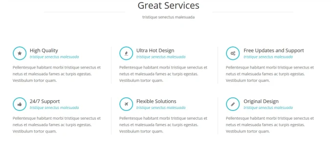
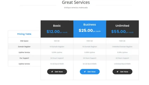
I'm using CTA Homepage and I want to add there 3 rows of content. If it was pure HTML was easy. Same but more time for me if it was Bootstrap.

Check the attached screenshots.
 

Attachments

  • paradoxbb_home.webp
    paradoxbb_home.webp
    29.8 KB · Views: 27
  • paradoxbb_home_1.webp
    paradoxbb_home_1.webp
    52.4 KB · Views: 28
  • paradoxbb_home_2.webp
    paradoxbb_home_2.webp
    26.6 KB · Views: 28
  • paradoxbb_home_3.webp
    paradoxbb_home_3.webp
    34 KB · Views: 27
You don't need grid for that. It is pure HTML and pure CSS.

For services block use html like this:
Code:
<ul class="services">
  <li>First service block</li>
  <li>Second service block</li>
  <li>Third service block</li>
  <li>Fourth service block</li>
  <li>Fifth service block</li>
  <li>Sixth service block</li>
</ul>
then add to css
Code:
ul.services { margin: 0; padding: 0; list-style: none; display: block; overflow: hidden; }
ul.services > li { margin: 0; padding: 0; display: block; width: 33.3%; float: left; }
ul.services > li:nth-child(4) { clear: left }
@media (max-width: 800px) {
  ul.services > li { width: auto; float: none; }
}
Not sure what you want to do with pricing and staff blocks on mobile.
 
Last edited:
For pricing tables a table class responsive with fixed the first row and scrolling the next 3.
For staff block:
1st row: Photo centered
2nd row: Text
3nd row: Email me full width button

Thank you for your code.
 
@Arty
Forget complicated pricing table. Table columns to be one below the other.

It's midnight here, so I'm going offline. I'll be again back in 9 hours. PM your PayPal email. Thank you.
 
For pricing something like this:
Code:
<div class="pricing">
  <div>First column here</div>
  <ul>
      <li>Basic</li>
      <li>Business</li>
      <li>Unlimited</li>
  </ul>
</div>
Code:
.pricing { overflow: hidden; }
.pricing > div { width: 25%; float: left; }
.pricing > ul { list-style-type: none; margin: 0; padding: 0; margin-left: 25%; }
.pricing > ul > li { display: block; float: left; width: 33%; min-width: 200px; }
@media (max-width: 800px) {
  .pricing > div { width: 200px; }
  .pricing > ul { margin-left: 200px; overflow-x: auto; }
}

For staff something like this:
Code:
<div class="staff">
  <div class="photo">Photo here</div>
  <div class="text">Text here</div>
  <div class="button">Button here</div>
</div>
Code:
.staff { overflow: hidden; }
.staff > .photo { float: left; width: 300px; }
.staff > .text, .staff > .button { margin-left: 300px; }
@media (max-width: 800px) {
  .staff > .photo { float: none; text-align: center; margin: 0 auto; }
  .staff > .text, .staff > .button { margin-left: 0; }
}
Haven't tested any of that code, but I think it should work without changes. Adjust numbers to whatever works better, make sure you adjust both width and left margin when changing that code.
 
@Arty
I really appreciate your effort to help me. I spent more than 8 hours till now and I was able to do somethings.
I also copied some stylevars from my php (bootstrap) project and works. But needs more time and patience.
While helping someone out with a design I was able to get the Zurb's flexbox grid system to work with XenForo.

Here is the CSS (I hosted it on a CDN, but upload the CSS file here): http://pastebin.com/781khLuH

Here is the guide for using their grid system: http://foundation.zurb.com/sites/docs/flex-grid.html

You'll need to customize the .row and .columns CSS slightly for width (I used 100rem for .row for example), but it works and is fully responsive.
This works well? No interference from XenForo?
 
Top Bottom