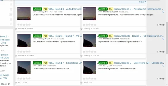
Grid layout for XFRM without Addon

Grid layout for XFRM without Addon

hemant_bhardwaj

Well-known member
hemant_bhardwaj submitted a new resource:

Grid layout for XFRM without Addon - Grid layout for resource manager

hey, everyone. one of my client want to achieve grid view in resource layout like we have grid layout with [TH] NODE with 2 column.
So here a simple CSS that you need to place it in Extra.less that will give it what you looking for.

CSS:
.structItem--resource {
    background-color: white !important;
    border-collapse: collapse;
    padding: 0px;
    width: 100%;
    min-height: 138px;
    height: 138px;
    height: auto;
    display: inline-block !important...

Read more about this resource...
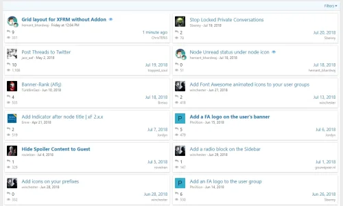
 
hemant_bhardwaj updated Grid layout for XFRM without Addon with a new update entry:

Font awesome Icon for download and update

.structItem-metaItem--lastUpdate dt,.structItem-metaItem--downloads dt{
font-size:0px;
}
.structItem-metaItem--downloads dd{
margin-left:18px
}
.structItem-metaItem--downloads dt:before {
font-family: FontAwesome;
font-size: 14px;
position: absolute;
margin-left: 0px;
content: '\f019';
}

.structItem-metaItem--lastUpdate dt:before{
font-family: FontAwesome;
font-size: 14px;
position: absolute;
content: '\f017';
margin-left: -15px;
}

Read the rest of this update entry...
 
I've just recoded this with css grid to make the layout a little more flexible.. It also uses variables for easy configuration and theme settings instead of hard-coded hex colours to ensure the correct colour scheme is used.

Feel free to play around with it and see if it works correctly. It's shown on screens larger than the medium viewport width.

Less:
@resource-grid-gap: 10px;
@resource-grid-width: 330px;
@resource-grid-thumb: 108px;

@media (min-width: @xf-responsiveMedium){
    @supports(display: grid){

        .block[data-type="resource"] .structItemContainer{
            display: grid;
            grid-template-columns: repeat(auto-fit, minmax(@resource-grid-width, 1fr));
            grid-gap: @resource-grid-gap;
            padding: @resource-grid-gap;
            background-color: @xf-contentAltBg;
        }

        .structItem--resource {
            background-color: @xf-contentBg;
            border-radius: 3px;
            box-shadow: 0 2px 8px rgba(0, 0, 0, 0.1);
            border-width: 0px;
            display: grid;
            grid-template-columns: @resource-grid-thumb 1fr;
            grid-template-areas: 'icon text' 'stats stats';

            .structItem-cell--icon.structItem-cell--iconExpanded{
                width: auto;
                grid-area: icon;
            }

            .structItem-cell--main {
                grid-area: text;
            }

            .structItem-cell--resourceMeta {
                grid-area: stats;
                width: auto;
                display: flex;
                flex-wrap: wrap;
                align-items: center;
                justify-content: space-between;
            }

            .structItem-cell--iconExpanded .structItem-iconContainer .avatar {
                width: 100%;
                height: auto;
                font-size: 56px;
            }

            .structItem-secondaryIcon {
                display: none;
            }

            .structItem-metaItem--rating{
                flex: 1 0 100%;
            }

            .structItem-metaItem--downloads,
            .structItem-metaItem--lastUpdate{
                flex: 0 1 auto;
            }

            .ratingStarsRow--justified {
                border-bottom: 1px solid @xf-borderColorFaint;
                margin-bottom: 4px;
                padding-bottom: 4px;
            }
        }

    }
}
 
I've just recoded this with css grid to make the layout a little more flexible.. It also uses variables for easy configuration and theme settings instead of hard-coded hex colours to ensure the correct colour scheme is used.

Feel free to play around with it and see if it works correctly. It's shown on screens larger than the medium viewport width.

looks much responsive brother. :D
 
I think theres a long title issue?
The date and time are pushed out the grid.
 

Attachments

  • hmm.webp
    hmm.webp
    41.9 KB · Views: 38
Thanks guys, i tried both your codes now. Just not having much luck lol. I'll get back to this at some point thanks.
 

Attachments

  • hmm3.webp
    hmm3.webp
    57.9 KB · Views: 33
Back
Top Bottom