XF 2.3 Getting rid/moving around this little island of options...

zzlpolitics

Active member
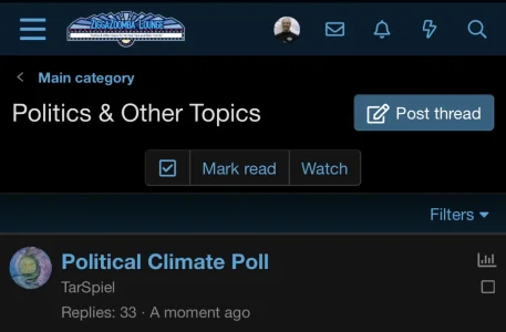
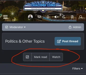
The theme I am using makes it more prominent but it still appears in the default style so the question would still apply. On mobile, which a majority of my users are on, the little island of options to mark read/watch take up too much prime real estate when looking at the topics in my opinion. I would be surprised if the vast majority, if not all, of my users don't use these features due to the previous forum they came from not having it. People will watch stuff but through other methods, etc.

Anwyay, since I don't see this as theme specific, how might I remove this "island" altogether or at least move it to the bottom of the page so it's not taking up prime space on mobile view?

Thanks in advance!
thumbnail_IMG_4795.webp
 
Solution
Sorry, that had a min-width (just copied the CSS from above, didn't pay attention).

To hide the top section all the time (this will hide the page nav and watch buttons on desktop + mobile).

Code:
   .block-outer:not(.block-outer--after) {
        display: none;
    }

or hide that just on mobile:

Code:
@media (max-width: @xf-responsiveNarrow)
{
   .block-outer:not(.block-outer--after) {
        display: none;
    }
}

But again, I'd be careful with this as it eliminates that section which is used on a lot of pages.
You have to ask whoever created the theme because he knows what code to remove in a certain part of his theme
I did ask the theme owner on his forum but since it appears on the default theme, though a little less obtrusive, I figured I could ask here and perhaps kill two birds with one stone. Or at the very least find out how to remove it on default.
 
Add this to your extra.less template
Less:
@media (max-width: 480px) {
    .block-outer {
        display: none;
    }
}
Thanks a ton. Really appreciate it.

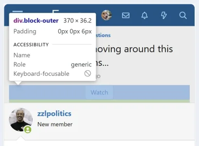
If you don't mind me asking, as I am trying to learn about this stuff, though I don't think I will ever become a coder, what in that code signifies that 'object'? Is it called the "block-outer"?

So much to learn.
 
Yes.

This is CSS/less.

The first line defines the screen width at which the code will run.
The second line is the element on the screen.
The third line applies the styling - in this case to not display it.

That's the name chosen by XenForo developers for this element.

View attachment 307085
Thank you guys for the explanations. I was a computer nerd when I was young but decided to get into filmmaking as all my friends got into coding/IT and now they're making several hundred thousand a year in their remote job while I have two worthless masters degrees and am currently unemployed! Should have stuck with it!
 
You might want to adjust that CSS or else users won't be able to see the page nav. By default XenForo hides the top page nav on mobile but it still shows at the bottom in the "block-outer".

Code:
@media (min-width: @xf-responsiveNarrow) {
   .block-outer:not(.block-outer--after) {
        display: none;
    }
}

You're also essentially removing the ability for users to watch a thread using this CSS (which might not matter to you)
Thank you. I actually just came back to say that this code doesn't appear to work for me. I tried both the before and yours and the island thing is still there on both my custom theme or the default theme. Any thoughts? And if we got it working, are you saying you couldn't use the watch function at all as in if a user posted something and they normally would have it auto-watched, now there's no watch, period?

Thanks and sorry to be a bother!

@Old Nick

(Still there)
IMG_4799.webp
 
And if we got it working, are you saying you couldn't use the watch function at all as in if a user posted something and they normally would have it auto-watched, now there's no watch, period?
Auto-watch for content is still functional, however, manually watching a thread is no longer possible as the Watch button is removed.

I tried both the before and yours and the island thing is still there on both my custom theme or the default theme. Any thoughts?
Did you tried the code in the extra.less template from the Default style?
 
Sorry, that had a min-width (just copied the CSS from above, didn't pay attention).

To hide the top section all the time (this will hide the page nav and watch buttons on desktop + mobile).

Code:
   .block-outer:not(.block-outer--after) {
        display: none;
    }

or hide that just on mobile:

Code:
@media (max-width: @xf-responsiveNarrow)
{
   .block-outer:not(.block-outer--after) {
        display: none;
    }
}

But again, I'd be careful with this as it eliminates that section which is used on a lot of pages.
 
Solution
But again, I'd be careful with this as it eliminates that section which is used on a lot of pages.
But you can use this one to apply only on thread pages:

Less:
[data-template="thread_view_type_question"],
[data-template="thread_view_type_suggestion"],
[data-template="thread_view_type_article"],
[data-template="thread_view"] {
    @media (max-width: @xf-responsiveNarrow) {
        .block-outer:not(.block-outer--after) {
            display: none;
        }
    }
}
 
Awesome, thank you guys. The mobile fix seems to be the best solution as that button island thing isn't obtrusive at all on computer.

Really appreciate you guys helping me out and learning all this new stuff!
 
Back
Top Bottom