Lack of interest Forward to registration page upon clicking on Sign Up Now! button

This suggestion has been closed automatically because it did not receive enough votes over an extended period of time. If you wish to see this, please search for an open suggestion and, if you don't find any, post a new one.

abdfahim

Well-known member
I couldn't find it in the suggestion forum, so hopefully I am not making any duplicate post.
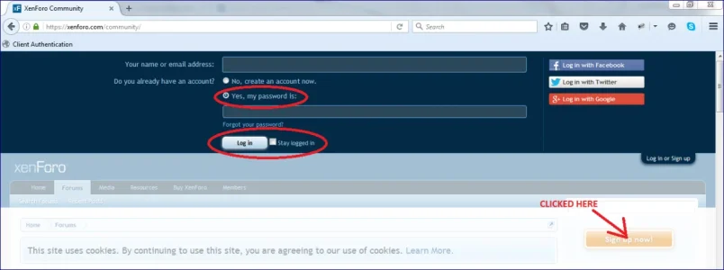
  1. I find it little confusing and redundant that once I click on yellowish "Sign Up Now!" button on the sidebar, it opens the login overlay instead of forwarding directly to the registration page, where I need to write (or not write) my user name and click on login/sign up button to be forwarded to the registration page. Isn't it better just to forward the user to the registration page directly upon clicking on the "Sign Up Now!" button, where he needs to fill the information anyway?
  2. In its current form, when I click on "Sign Up Now!", the overlay opens with default radio "Yes, my password is:" and button text "Log in" (image below), which is disturbing. It should at least have "No, create an account now." selected with "Sign up" as the button text.
Capture1.webp
 
Last edited:
Upvote 1
This suggestion has been closed. Votes are no longer accepted.
Personally I think a better solution is to change the phase for that button. I have done this already and the button now says "Log in or Sign up". This way, both existing and new users know to use the same button. As for setting the "No, create an account now" radio button as the default, I don't think this is preferable to most sites as the form will be used more by existing users who are logging back in (so it saves a click for them and prevents them from accidentally trying to create a new account).
 
Something like having a "New User" button and then below it the Log In now fields would be beneficial. That way, you could log in from there or if you click the New User button it take you to a registration page.
 
Personally I think a better solution is to change the phase for that button. I have done this already and the button now says "Log in or Sign up". This way, both existing and new users know to use the same button. As for setting the "No, create an account now" radio button as the default, I don't think this is preferable to most sites as the form will be used more by existing users who are logging back in (so it saves a click for them and prevents them from accidentally trying to create a new account).

Actually, I didn't mean to set it to "No, create an account now" by default all the time. Only when that overlay appears due to a click on the "Sign Up Now!" button, then it should select that radio. Otherwise, if the overlay appears due to a click on "Login or sign up" button on the top-right corner, like you said, it is logical to select "Yes, my password is:" by default.

About the button phrase, I personally prefer to have either "Log in" or "Sign up" text based on the selection of the radio, (which is already in place, images below are from xenforo.com website). So, all is required to select the "No, create an account now" radio when the overlay appears upon clicking on "Sign Up Now!" button, because it's most likely that the user intend to create an account if he clicks on that button.

Capture1.webp
Capture2.webp
 
Last edited:
Something like having a "New User" button and then below it the Log In now fields would be beneficial. That way, you could log in from there or if you click the New User button it take you to a registration page.

Ya, that could do as well. But don't you think opening the login overlay upon clicking "Sign Up Now!" button is redundant, provided that you will be forwarded to the registration page anyway?

If there was an option for a quick registration from the overlay (like having filled up only mandatory fields), only then it would make sense to me.
 
Back
Top Bottom