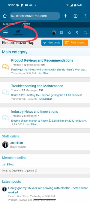
jimelliott New member Licensed customer Sep 5, 2025 #1 My logo is showing up as too small on mobile but it's fine on desktop. Here's a screenshot and a link to my forum. Electric Razor Rap Attachments Screenshot_20250905-063514.webp 65.5 KB · Views: 17
My logo is showing up as too small on mobile but it's fine on desktop. Here's a screenshot and a link to my forum. Electric Razor Rap
Mr Lucky Well-known member Licensed customer Sep 5, 2025 #2 This addon allows you to have a different logo on mobiles [OzzModz] Logo Essentials Jan 6, 2020 Center your logo, specify navigation small logo URL, set size dimensions and more! Upvote 0 Downvote
This addon allows you to have a different logo on mobiles [OzzModz] Logo Essentials Jan 6, 2020 Center your logo, specify navigation small logo URL, set size dimensions and more!
Davyc Well-known member Licensed customer Sep 5, 2025 #3 Add this to your extra.less file. Code: /* Keep logo responsive */ .p-nav-smallLogo { display: none !important; } .p-header-logo { max-width: none !important; } .has-js .p-header { display: block; } Upvote 0 Downvote
Add this to your extra.less file. Code: /* Keep logo responsive */ .p-nav-smallLogo { display: none !important; } .p-header-logo { max-width: none !important; } .has-js .p-header { display: block; }
jimelliott New member Licensed customer Sep 5, 2025 #4 Davyc said: Add this to your extra.less file. Code: /* Keep logo responsive */ .p-nav-smallLogo { display: none !important; } .p-header-logo { max-width: none !important; } .has-js .p-header { display: block; } Click to expand... Thank you! Worked like a charm. Upvote 0 Downvote
Davyc said: Add this to your extra.less file. Code: /* Keep logo responsive */ .p-nav-smallLogo { display: none !important; } .p-header-logo { max-width: none !important; } .has-js .p-header { display: block; } Click to expand... Thank you! Worked like a charm.
![[OzzModz] Logo Essentials](/community/data/resource_icons/7/7551.jpg?1578353723)