You are using an out of date browser. It may not display this or other websites correctly.
You should upgrade or use an alternative browser.
You should upgrade or use an alternative browser.
Flat Awesome + - PixelExit.com [Deleted]
- Thread starter Russ
- Start date
Responded
Responded back!Responded
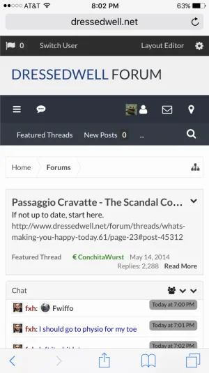
Russ am i putting this somewhere special in the settings because it doesnt work in extra.cssFor the logo, just use a media query at your desired width:
Code:@media (max-width:@maxResponsiveWideWidth) { .Responsive #logo { float: none; margin: 0 auto; } }
Russ am i putting this somewhere special in the settings because it doesnt work in extra.css
Try placing it at the top of your extra.css, if that works then you may have some bad CSS inside extra.css causing it not to load at the bottom.
Ah text logo:
Code:
@media (max-width:@maxResponsiveWideWidth) { .Responsive #logo { float: none; margin: 0 auto; text-align: center;} }that did it. oddly it seems slightly to the right for some reason.Ah text logo:
Code:@media (max-width:@maxResponsiveWideWidth) { .Responsive #logo { float: none; margin: 0 auto; text-align: center;} }
that did it. oddly it seems slightly to the right for some reason.
Check : Style Properties: Header and Navigation -> Logo Text CSS
Looks like you may of added a left: 10px;
You can remove that so it will never have left 10px, or you'll need a media query to adjust it only in mobile:
Code:
@media (max-width:@maxResponsiveWideWidth) { .Responsive #logo a { left: 0;} }You can combine this bit with the other center logo if you wanted too as well:
Code:
@media (max-width:@maxResponsiveWideWidth) { .Responsive #logo { float: none; margin: 0 auto; text-align: center;} .Responsive #logo a { left: 0;} }thanks Russ. i just took out the left 10 and it seems ok now. i think that was a holdover of some change we made a long time ago.Check : Style Properties: Header and Navigation -> Logo Text CSS
Looks like you may of added a left: 10px;
You can remove that so it will never have left 10px, or you'll need a media query to adjust it only in mobile:
Code:@media (max-width:@maxResponsiveWideWidth) { .Responsive #logo a { left: 0;} }
You can combine this bit with the other center logo if you wanted too as well:
Code:@media (max-width:@maxResponsiveWideWidth) { .Responsive #logo { float: none; margin: 0 auto; text-align: center;} .Responsive #logo a { left: 0;} }
That is just a screenshot of the page buttons. No, it is not on a mobile device.
The page buttons are still messed up.
But why dosen't the next button go next to the numbers and then there will just be more page numbers under the arrow?
But why dosen't the next button go next to the numbers and then there will just be more page numbers under the arrow?
It's designed like that from the XenForo stand-point.
Similar threads
- Replies
- 136
- Views
- 11K


