Dixie McCall
Well-known member
Hello
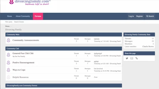
I know my community isn't a great fun topic but it is necessary. I'm TRYING to find a balance between calming pastel colors but not make it look like an Easter egg. The lavender looks okay on my PC but looks brown on my IPAD. I'm trying to achieve a calm, inviting and happy place.
We aren't pros obviously. I will be using the Old School template as soon as a figure out a few things with it but right now I have it on the default.
Any suggestions would be great. (Be gentle)
I know my community isn't a great fun topic but it is necessary. I'm TRYING to find a balance between calming pastel colors but not make it look like an Easter egg. The lavender looks okay on my PC but looks brown on my IPAD.
We aren't pros obviously. I will be using the Old School template as soon as a figure out a few things with it but right now I have it on the default.
Any suggestions would be great. (Be gentle)
Last edited:
