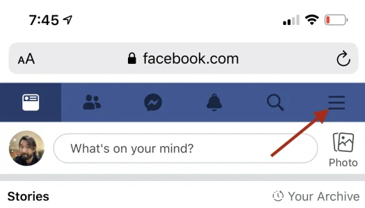
Get rid of the hamburger menu and replace it with a bottom floating menu with actionable numbers (the red box/number that appears on "What's new", etc...) on mobile only.
This would only work if people chose a FontAwesome icon for those menus at the bottom (or just fewer items before the "more" option).
Facebook, Spotify, etc. (apps) have removed it because it's been discovered that there's more user engagement that way.
The second answer here has a good explanation about it as well as a video.

 ux.stackexchange.com
If this is the new "norm" the next style to follow should be getting rid of it, creating 4-5 slots for a floating bottom menu and a "hamburger" page with "more" for those with more than 1 add-on that requires a menu item.
I would suggest a hard press, like reactions, to access the subnav of each item that stays until dismissed.
This would only work if people chose a FontAwesome icon for those menus at the bottom (or just fewer items before the "more" option).
Facebook, Spotify, etc. (apps) have removed it because it's been discovered that there's more user engagement that way.
The second answer here has a good explanation about it as well as a video.
Mobile website menu. Should hamburger menu be on left or the right?
Quite a while ago we decided to move our hamburger menu (I know they are evil but we got stupid amount of subcategories) to the right. Reasoning behind that was based on accessibility and in indoor...
If this is the new "norm" the next style to follow should be getting rid of it, creating 4-5 slots for a floating bottom menu and a "hamburger" page with "more" for those with more than 1 add-on that requires a menu item.
I would suggest a hard press, like reactions, to access the subnav of each item that stays until dismissed.
Upvote
4

