Hi all.
I've done some searching and can't seem to find what i'm looking for...
Basically i've got a TitanEmbed widget installed in the Forum Overview: Top area. It works fantastically on computer but on mobile it just doesn't do the job, far to small (even though i've set it to scale correctly etc), can literally not even see one full message line.
So my question, is there a way I could potentially get it to either a) work correctly on mobile, by making it taller (more height) or b) just disable it on mobile.
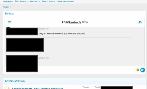
I've attached a couple of screens just so you get a feel for what I mean.
Any help would be greatly appreciated. I'm no wizard with CSS but usually get by with the search function but im struggling to find anything suitable this time.
Thanks
- Kirby
I've done some searching and can't seem to find what i'm looking for...
Basically i've got a TitanEmbed widget installed in the Forum Overview: Top area. It works fantastically on computer but on mobile it just doesn't do the job, far to small (even though i've set it to scale correctly etc), can literally not even see one full message line.
So my question, is there a way I could potentially get it to either a) work correctly on mobile, by making it taller (more height) or b) just disable it on mobile.
I've attached a couple of screens just so you get a feel for what I mean.
Any help would be greatly appreciated. I'm no wizard with CSS but usually get by with the search function but im struggling to find anything suitable this time.
Thanks
- Kirby


