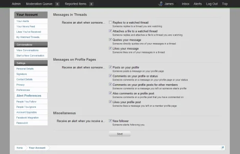
[Directory] Hottest Style features for Xenforo

Digital Doctor

Well-known member
Has anyone seen any cool style features that made them say "Wow" ... I got to have that !

[1] I saw one I liked: [New] icons on the Forum Listing.
xencolor-xfstyles-net-new-icon-on-forum-list-jpg.17133

Source Style: XenColor Pro Site: xfstyles.net

[2]I like 8wayrun.com's subforums listed on Forum List.
30dc9p2.jpg

Source Style: 8wayrun.com

[3] I like Gunero Gaming's moving image in header (visit the site to see the motion)
gunero.gaming.moving.image.in.header.webp
site: http://gunero.com/ looks like it is DNSing [April 2012]
[4] Hovering causes an item in the Postbit to expand - works great !
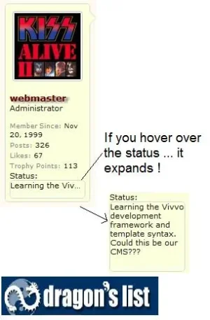
expanding.postbit.item.status.webp
See it live at:
http://www.dragonslist.com/community/threads/cms-open.22691/
Note: this feature was removed from dragonslist [April 2012]
[5] I like how post details are hidden unless they are needed.
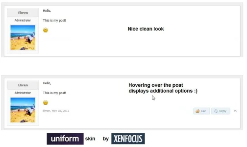
hover.over.post.xenfocus.uniform.webp
www.xenfocus.com - demo: http://www.xenfocus.com/skins/uniform/index.php

[6] I like the subtab area - does away with the bulky default look. I've never liked the subtab area anyway. DarkImmortal does another great thing here ... gets rid of the Help Tab and calls it [Misc].

gamingmasters.co.uk.cool.subtab.webp
site: http://www.gamingmasters.co.uk/help/

[7] Large, but not annoying ads in the first post.
site: ign.com/boards example
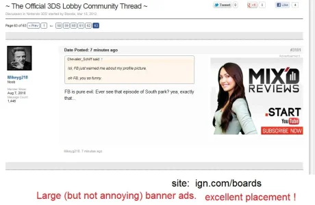
banner.ads.to.the.right.in.first.post.IGN.COM.webp

[8] Sexy Tab icons :)
navtabicons-png.13821

available as a tips and guides from SchmitzIT.

[9] User Ribbons (Jaxel and Shelley) - more later, see the end of the thread for now.

[10] Register Now Images in right column
I especially liked this transparent image. Very effective. [ Demo ]
register-now-jpg.29136

[11] Retina Display Avatars
 
Has anyone seen any cool style features that made them say "Wow" ... I got to have that !

[1] I saw one I liked: [New] icons on the Forum Listing.

xencolor-xfstyles-net-new-icon-on-forum-list-jpg.17133


Source Style: XenColor Pro Site: xfstyles.net

[2]I like 8wayrun.com's subforums listed on Forum List.
30dc9p2.jpg

Source Style: 8wayrun.com

[3] I like Gunero Gaming's moving image in header (visit the site to see the motion)
View attachment 17506
site: http://gunero.com/

[4] Hovering causes an item in the Postbit to expand - works great !
View attachment 17533
See it live at:
http://www.dragonslist.com/community/threads/cms-open.22691/

[5] I like how post details are hidden unless they are needed.
View attachment 22852
www.xenfocus.com - demo: http://www.xenfocus.com/skins/uniform/index.php

[6]

I like the subtab area - does away with the bulky default look. I've never liked the subtab area anyway. DarkImmortal does another great thing here ... gets rid of the Help Tab and calls it [Misc].

View attachment 23001
site: http://www.gamingmasters.co.uk/help/

1. I've designed a set of node icons to get this effect which I did plan on doing about 6 months ago (I posted them in the test section) I just haven't got around to doing that yet due to it not suiting the style(s) I've been developing. Since the shaping of the icons I designed can't be done with css3 (atleast I'm not sure they can) it's something still on my todo list.

2. Grid system. Quite frankly I like and prefer this structure/layout than dropdown menus I just don't like the amount of template edits this requires to get such a structure. Not sure whether this can be made with minimal edits yet to the template but as soon as this can be accomplished I'll be using the subforum grid system layout over the dropdwn menu.

3. Moving/scrolling anything is a distraction for me to the point it's an irritating feature.

4. Can't comment I couldn't really be bothered clicking the link to see what that link entailed.

5. Cleaner I have to admit but buttons appearing and disapearing is yet another distraction for me that I don't like. It's not something I would personally implement but I can certainly see why many would implement this for a cleaner minimalistic look.

6. Misc, help, Extraordinary documentation. Down to preference how you word your subtab titles nothing groundbreaking imo and certainly not something that sets this as "groundbreaking". imo.
 
[1] I saw one I liked: [New] icons on the Forum Listing.

xencolor-xfstyles-net-new-icon-on-forum-list-jpg.17133


Source Style: XenColor Pro Site: xfstyles.net

[2]I like 8wayrun.com's subforums listed on Forum List.
Source Style: 8wayrun.com

[3] I like Gunero Gaming's moving image in header (visit the site to see the motion)
View attachment 17506
site: http://gunero.com/

[4] Hovering causes an item in the Postbit to expand - works great !
View attachment 17533
See it live at:
http://www.dragonslist.com/community/threads/cms-open.22691/

[5] I like how post details are hidden unless they are needed.
View attachment 22852
www.xenfocus.com - demo: http://www.xenfocus.com/skins/uniform/index.php

[6] I like the subtab area - does away with the bulky default look. I've never liked the subtab area anyway. DarkImmortal does another great thing here ... gets rid of the Help Tab and calls it [Misc].

site: http://www.gamingmasters.co.uk/help/

Love the idea of this thread as I adore styling. But DigDoc sorry I don't share most of your picks!

1. Yes I like the "New" flagging though not the actual icon used on this. But that's easy to change.

2. Jury's out. Not sure ...

3. Can't stand moving stuff when I'm trying to navig about or peacefully read through.

4. Hovering looks good. ++ on that one!

5. Nope - don't like things being invisible and certainly not the Like / Reply functions which are core activities to keep the flow going.
Clean look can be obsessive and obstruct function.

6. Help documentation FANTASTIC - huge help in supporting users with good info. That always makes people feel more relaxzed and communicatiove.
Can refer support requests to this on specifics as it'll be easy to locate.

7. Jake Bunce's Category designs. Scrumptious.

8. Fuhrmann's Profile Tabs options.

9. Placing the Start Conversation button on the sidebar on Profile page. I have it on the far right AS WELL just to encourage!
 
love the #1 new / old icons. been looking round here for that edit & haven't found it yet. I feel like I've seen it here. anyone know where it's at?
 
It's just a regular sprite like any other.

Just change the left position to move it over the border.
 
7. Jake Bunce's Category designs. Scrumptious.

8. Fuhrmann's Profile Tabs options.

9. Placing the Start Conversation button on the sidebar on Profile page. I have it on the far right AS WELL just to encourage!

Please include the helpful image snapshots or links of these items, such as what DD has, so that all of us can reference them easily :)
 
For what it's worth, I would strongly recommend against any critical design elements that depend upon cursor "hovering"; it's not possible on touch-based devices.
 
One of my favorite features is actually on my own site. :p

A visitor bar that stays at the top when you scroll down. The "Top" link is one of the most used things.

userbar.webp

My next goal is to have the search box appear in it when you scroll down below the navbar.
 
Top Bottom