XF 2.2 CSS below message box and side nav

ed762

Member
Hi all,

I am trying to change some colours of containers by adding CSS in extra.less I figured out for side bar it is .p-body-sidebar .block-container

Could anyone let me know what it is for the widget location: Below messages, below quick reply ? Is there a list I can use as reference?

I am also trying to figure out how to change the font and colour in the member Info box to the left of a post, so far I can only change half of it through the properties, is there a way to force everything in that member info box through extra.less
 
Last edited:
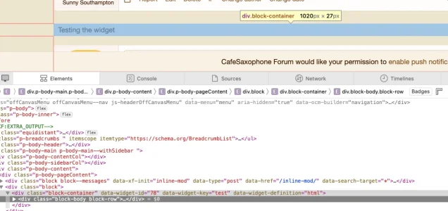
Best thing to do is use your browser inspect elements. Right click the widget and then look in the inspector for the widget key or the widget id

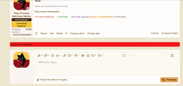
I just put a test below messages and it is easy to style the actual widget (as opposed to styling the widget position).

In this case either

Code:
[data-widget-id="78"]
{background:red}
or

Code:
[data-widget-key="test"]
{background:red}


Screenshot 2024-04-26 at 15.22.40.webp

Screenshot 2024-04-26 at 15.34.01.webp
 
Last edited:
You're welcome. Knowing about inspecting elements is a huge step in customising. You should be able to do the member info box using the same process.
 
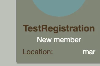
Only partial success so far, it has problem with "location" or anything within the <dt> tag.
It might be you want to style the dl and you can use nth child to determine which one

And so the dt in the second dl would be

Code:
.message-userExtras dl:nth-child(2) dt
{background:green}
 
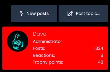
This will give you what you're after - add it to your extra.less and change the widget ID to what yours is.

Code:
[data-widget-id="38"] .block-row {
    margin: 0;
    padding: 12px 14px;
    background: red;
}

You can probably lose the margin and padding, but try it first. Depending on your background intensity, you may need to adjust the text colours too.

1714154178708.webp
 
Oh! I misread your OP - it's the section in messages to the left you want to change. You can do this in your style properties, look for 'Messages' and then this block - the red arrows point to what you need to adjust the background and the text. Keep my previous one handy as it may be useful to you in the future lol.

1714155077996.webp
 
Try these and see if this is what you are looking to achieve:

Code:
.pairs.pairs--justified>dd {
    float: left;
}

.pairs>dt {
    color: #ffffff;
}

This will colour everything on the location line white and float the text to the left, so there's no huge gap showing. Let me know if this is what you wanted as I'm just guessing these are the parts that were bugging you.
 
.pairs.pairs--justified&gt;dd {<br> float: left;<br>}<br><br>.pairs&gt;dt {<br> color: #ffffff;<br>}
Adding this CSS to extra.less also changes the colour of "reply" and "thread" stat in new post widget. Ha, maybe this is not worth screwing around with.
 
This should limit the colour shift to just the message user info parts

Code:
.message-userExtras .pairs>dt {
    color: #f6f5f4;
}

Sometimes you have to nail it to a specific element, especially when dealing with global elements ;)
 
Back
Top Bottom