Style Classic vBulletin 3 skin --- development log

Background header color

Basically the background color of where your logo is and surrounding your navigation menu

PHP:
#header {
background-color: #576288 !important;
}
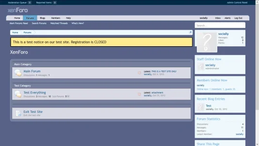
 
Navigation color / navigation tab color (background)
PHP:
.navTabs {
background-color: #DCDCE8 !important;
}

Font color to navigation

PHP:
.navTabs .navLink, .navTabs .SplitCtrl {
color: black !important;
}
 
I call it the "sub navigation menu". But basically the navigation menus that are under the main navigation tabs

PHP:
.navTabs .navTab.selected .tabLinks {
background-color: #576288 !important;
}

I kept it with the background color, but this did also look a little cool in black as well. I just didn't want to change the font size as it did seem harder to read in the current font size. So I simply stuck with the default purple.
 
The road so far (see attached)

Alpha build (not even beta and beyond far from final release / gold release)

I'm getting sleepy and so I'll pick this up later.

vbulletin-inspired-alpha.webp
 
  • Like
Reactions: R_A
Coloring for the bread crumb bar

PHP:
.breadcrumb {
background-color: #DDDEE9 !important;
border: black !important;
}

coloring for the navigation when it is selected.

PHP:
.navTabs .navTab.selected .navLink
{
background-color: #D9DAE6 !important;
}
 
A few lose ends including the background for the side bar; which I'll be editing later, but this covers the base in which to mold on

PHP:
.secondaryContent {
background-color: #D9DAE6 !important;
}
 
I've been thinking about creating this before, but with the lawsuit I didn't feel motivated...

To what degree do you want to make it look like the vb3 skin?
 
Log-in bar (that nice little drop down menu that shows up when you click "log-in")

PHP:
#loginBar
{
background-color: black !important;
color: white!important;
border-bottom: 1px solid #D9DAE6 !important;
}
 
Considering the code is in EXTRA.css you shouldn't need to !important everything...

Additional bytes, additional filesize, bigger download, longer execution, etc.
 
I've been thinking about creating this before, but with the lawsuit I didn't feel motivated...

To what degree do you want to make it look like the vb3 skin?
It's going to be more inspired and maybe not exactly like vBulletin 3. XenForo and vBulletin do not have an exact layout and truthfully XenForo has more layering to it. I'm not going to be really editing this to adjust for spacing in an attempt to have them look identical.

Of course my inspiration of vBulletin 3 is the limited edition in which they had more of a purple tone to it. I forget which version that was, but I always like it and was kind of sad that they ended up going a little more brighter (lighter) with a lot of off white in their releases.
 
Considering the code is in EXTRA.css you shouldn't need to !important everything...

Additional bytes, additional filesize, bigger download, longer execution, etc.
That has almost never been my experience with XenForo. And one of the things I actually find confusing and disagreeable when skinning XenForo.

Don't ask me why.... I don't understand it either..... But more than often simply doing a color change without !important does not guarantee a color change. So I've just gotten into the habit now to do it "as is" (with the important command). Rather than having to keep double checking my work :confused:
 
Considering the code is in EXTRA.css you shouldn't need to !important everything...

Additional bytes, additional filesize, bigger download, longer execution, etc.

Some still need it though, he really should be editing Style Properties first but I do the same thing sometimes as well.
 
Some still need it though, he really should be editing Style Properties first but I do the same thing sometimes as well.
Yeah, just that EXTRA is usually loaded last so most times the last declared property overrides.
 
This changed the coloring of the text for the log-in bar, including the background where you enter the text, and also the little "nub" (tab) that you see in the right side for the log-in menu

PHP:
#loginBar .textCtrl {
background: black !important;
color: white !important;
}

#loginBar a {
color: white !important;
}

#loginBar #loginBarHandle {
font-weight: bold;
background-color: black !important;
box-shadow: 0px 2px 2px white !important;
}


#loginBar .textCtrl {
background: black !important;
color: white !important;
}

#loginBar .textCtrl:focus {
background: black  !important;
}
 
Re-did those last 2 post to include
http://xenforo.com/community/thread...skin-development-log.40718/page-2#post-442992
http://xenforo.com/community/thread...skin-development-log.40718/page-2#post-443011

font-weight: bold;

Reason being to improve the reading of a white text with a black background. And to help direct that rule toward a few add-ons that may plug-in there (depending on setup).

So this is both a visual change as well as a compatibility change.

PHP:
#loginBar {
background-color: black !important;
color: white !important;
font-weight: bold;
border-bottom: 1px solid #D9DAE6 !important;
}
 
#loginBar .textCtrl {
background: black !important;
color: white !important;
font-weight: bold;
}
 
#loginBar a {
color: white !important;
font-weight: bold;
}
 
#loginBar #loginBarHandle {
font-weight: bold;
background-color: black !important;
box-shadow: 0px 2px 2px white !important;
}
 
 
#loginBar .textCtrl {
background: black !important;
color: white !important;
font-weight: bold;
}
 
#loginBar .textCtrl:focus {
background: black  !important;
font-weight: bold;
}
 
Since we're already playing with the log-on...

This will change the log-in button coloring and insure for easy notice (you want the log-in to be kind of seemly seem-less with the theme, but you also want it to be a little distracting).

PHP:
#SignupButton .inner {
background-color: black !important;
color: white !important;
font-weight: bolder;
}
 
Top Bottom